Interstellaria was one of the last games I kickstarted about a year ago; the developers promised a 2D space exploration style game in similar vein to one of my all time favorites — Star Control 2. It’s finally out and we have a game that is a good example of interesting design… marred by a poor UI.
Shipping Out:
The story of Interstellaria takes place after a great war where humanity now lives on colonies throughout the Universe, thanks to the development of sub space travel using a device called interstellaria. You play a random person on a human colony who wants to see the stars and gets a job on a traveling ship, but is destroyed by a mysterious alien ship.
The game follows your adventure after discovering a derelict ship and deciding to explore the Universe for fame, fortune and fighting aliens. Similar to Star Control, there is an overall plot going on, this time involving the kidnapping of your colony, but you are free to ignore or follow it as you see fit.
Gameplay is split between three different systems: exploration/ship management, combat and ground exploration. You start out with a two man crew on a basic ship, but you can eventually expand that to multiple ships and crew members. Each ship type has a set armor value that determines health, space/size and energy which has to do with equipping components.

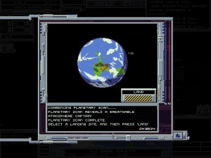
There are a lot of planets to explore; some are empty, while others feature items and quests for you to discover
As you explore the Universe, you’ll find component modules that can be installed on ships; these range from meeting crew needs to navigation, weapons, engineering and so on.
In order to make use of a module, you’ll need someone manning it and dedicate ship energy to it; weapons need to be equipped and energy applied to them to work.
As someone makes use of a module, they’ll grow more skilled at it which will improve how they use that specific module type.
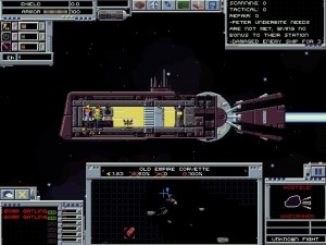
When combat starts, you’ll control your ship (or fleet) via the map at the bottom of the screen. You won’t see the enemy ships on the main screen, but you can view their position and attacks on the map.
Combat plays out very much like an arcade shooter as you try to dodge enemy projectiles while maneuvering into range for your tactical officer to get a shot off.
The universe is not randomly generated but there are a ton of planets to explore. Planets are locked either due to plot or the fact that you need to find a star map to discover them. Once on the ground, Interstellaria changes to a basic 2D platformer.
The Away Team:
The planets are full of items to find, quests to discover and enemies to kill; while they aren’t randomly generated, they will respawn resources and enemies when you leave and return.
Any crew members that you have in your fleet can come with you to explore, and can be equipped with a variety of gear. Ground control is very basic as units will move based on the waypoints you set. Combat is entirely hands off, all you need to do is click on an enemy and your group will attack with whatever weapons they have.
Combat both in space and on the ground is permanent and it’s possible that you will lose ships or crew members if you aren’t careful. However, you can replace them as long as you have the money and you can treat your people as red shirts.

Combat is very straightforward, but becomes a cluttered mess when you start dealing with multiple ships in a fleet
Interstellaria does scratch that itch of Star Control 2, by providing the player with the means to explore a giant universe and create their own personalized ships.
The progression model of getting bigger ships and more crew members is great and provides the player with a great carrot on the stick to go for.
Despite the great gameplay, Interstellaria’s UI threatens to keep things from taking off.
Garbled Communication:
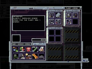
Interstellaria’s UI is sadly an all around example of poor design and similar to my post on Door Kickers is a good example of what not to do. Some basic examples: you have buttons on the main screen put at different parts of the screen for no rhyme or reason, multiple screens of UI are used for simple tasks and characters tend to get bunched up without an effective way of selecting someone.
Even the screens themselves aren’t that intuitive and you will have to go through several screens in order to get important info on your ship, crew and items. In order to fly around space for instance, you have to go to the separate space map to plot a course, but then while flying there is a mini map comes up to show you what’s going on, however you cannot interact with it. All in all, the UI appears to be as retro as the graphics style and that’s not good; and things get worse when you throw in multiple ships.

The UI For managing items and crew members is one of the worse I’ve seen; requiring you to jump between multiple screens to do simple tasks
During combat, you can only have one ship on the screen at a time which isn’t bad at the start. However, throw in multiple ships, crews, modules, power constraints and the whole thing becomes a jumbled mess.
Little details like weapon damage, characters’ moods and even how much power you’re actually using, are either hidden or just not show.
Then there are little things that could be expanded on; different types of weapons and ships having more personality, the various alien species and providing more things to do on planets and adventures.
From playing the game, it seems like the developer was trying to come up with a shortcut to their UI by having one UI for all the game modes and screens. Unfortunately that kind of thinking doesn’t work with multi system games, as the point is each system is its own unique thing; in turn needing a specific UI. With the original X-Com and Star Control 2, each system had a completely different UI, because each mode was obviously different.
The only saving grace that Interstellaria has is that the game’s design is strong enough that it’s still worth playing. However this is a case where an otherwise excellent game simply becomes a good or just average game due to how bad the UI is.
Brave New Future:
Interstellaria is a game that I want to like more than I am. The open ended progression and game space works well with the setting, and the game is just deep enough to keep your interest without becoming bogged down by too many mechanics.
But once again I shouldn’t have to fight a UI to enjoy a title; the fact that Star Control 2 featured better UI design over 20 years ago is not a good thing to say regarding a game released in 2015. I still recommend Interstellaria if you can look past the UI, as the developer will continue to work on the game and there is a chance that things will get fixed. For now, Interstellaria’s quality is as unknown as our own future when it comes to space travel.
If you want to see more on Interstellaria, here is the spotlight that I did on the game.


