Building accessible games that aren’t dumb down is every great designer’s big challenge. Complexity doesn’t always equal great gameplay, and more often than not, will drive people away. Today’s post looks at some basic tips that can go a long way towards making your game easier to understand.
1: Reduce Repetitive Actions
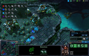
Repetitive actions fall into two camps in game design. The first example is repetitive actions that are repeated at the start each time you play. If you play strategy games, then you know about how the early game plays out the same way. The first minute or so of a Starcraft match are the same every time no matter the skill levels of the players.
The second group is repetitive actions that add steps to a process. Let’s say for every time you want to use an item on your character you need to do the following: Pause the game, click on inventory, click on the use command, click on the item, click on the character, and then click a confirm window.
A good sign of a bloated UI is having repetitive actions. You’re not asking the player to make interesting choices, but jump through hoops to do simple tasks.
Actions that are going to be the same each time or repeated should be made as elegant as possible. One, it makes your game easier to learn. Two, it will reduce the tedium for players who have already figured things out.
This is where the idea of context-sensitive controls come into play: Allowing you to attach multiple commands to a single input. There are other ways to enhance your UI, but that’s beyond the scope of this post. While it may not seem bad to have two or three steps to an action, you need to remember that the player is going to be doing it constantly.
2: Always Show Relevant Information
Games built around multiple systems are by their nature hard to learn. Players have to make decisions based on multiple sources of information; often times spread around the game. You may think it’s cumbersome to repeat the same information in multiple areas of your UI, but its good design to keep the player informed.
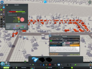
The use of tool-tips to provide relevant information helps with this point. One of the best parts of the UI for Cities: Skylines was how the game would always bring up information related to the utility that you were currently looking at.
Using a dynamic UI may be out of scope for smaller games, but tool-tips can be a cheaper alternative.
The player should never have to hunt around your game’s UI to make a decision.
Another use of tool-tips in this regard is to show advanced information. A great example would be from Age of Empires 3 and Rise of Nations who both showed detailed descriptions of stats and choices if the player wanted to know.
3: Using the Main Screen
Depending on your game, this one could be very easy or downright impossible to do. The more areas that a player has to focus on in a game, the harder it gets to keep track of everything. One of the goals of successful UI Design is to create a “main screen” that gives the player all the information that they would need.
The main screen should provide all relevant information about what’s going on. There are little tricks that you can use to make an effective main screen. Dynamic tool-tips can appear or disappear depending on the cursor’s focus to show information when the player needs it.
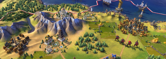
Some games can use the art of the game as part of their design. The Civ series has gotten good at using the main screen to show the general status of what’s going on.
You need to figure out what are the most important details to playing and understanding your game and have them present at all times. The fewer screens you need to show someone what’s going on, the easier it will be for them to learn your game.
Simple Streamlining:
Making your game easier to learn is always a good thing. A sign of a smart designer is finding and reducing any walls that are stopping people from learning. There is a difference between depth and needless complexity, and these tips should help to reduce the latter.
If you enjoyed this post, please consider donating to the Game-Wisdom Patreon campaign. Your donations can help to keep the site going and allow me to produce more great content. Follow me on Twitter @GWBycer, and you can find daily video content on the Game-Wisdom YouTube channel.


