Playing through Tower Climb and doing both a video spotlight and written review of it, I called the game out as being “button-heavy” when it comes to its controls and game design. Button-heavy is an unusual term and one that I want to delve into a bit more in today’s piece, because it’s one of those issues that is not always apparent from the start.
Mechanic Overload:
Button-heavy is a complaint that has to do with both a game’s design and the control functionality present and we can define it as the following:
- Button-heavy: When a game requires too many button commands for interacting with the game and controller.
Button-heavy is a concept that only exists in real-time or action-based titles, because it’s about putting too many actions in front of the player at one time. There are two sides to the problem of button-heavy games. The first one is where the gamepad or keyboard is stuffed with different commands spread throughout the device that need to be used at a moment’s notice.
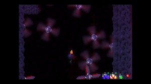
Looking at a traditional gamepad today, not counting the analog sticks or pause/select buttons, there are eight buttons that can be interacted with. Games that are considered button-heavy would require the player to be making use of six or more buttons within moments of each other. With Tower Climb for example, playing the game requires the use of nine buttons for individual actions, not counting buttons for movement (if you’re using a keyboard.)
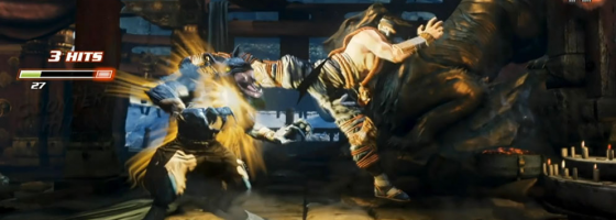
Fighting games straddle the line of being button-heavy due to the number of inputs needed to make use of combos and special attacks; this is one of the reasons that led to Netherealm streamlining their combat systems with MK 10 and Injustice.
Games that are button-heavy tend to not have context-sensitive actions and instead just lay everything out for the player to do at once. We see this with a lot of simulation-focused or survival games, where they would have multiple button commands for simple variations of one mechanic, instead of having one button do everything within the context of the action. While it is true that complex titles tend to make use of multiple mechanics, there is a line where there are too many actions going on for one title and the game begins to bog down because of it.
Imagine a game where instead of pressing one button to open or close a door, the game has different buttons for putting a key in the lock, unlocking the door, turning the knob, opening the door, closing the door, putting the key back in the knob and locking the door. For one thing, that would never fit on a gamepad without making it even more awkward; second, the amount of busy work that would involve would drive most people crazy.

Many modern AAA titles feature streamlined control schemes that allow for a lot of actions without bogging down the control scheme
This is why a lot of the bigger hits in recent years are games that have streamlined both their control scheme and the number of actions needed at one time.
With the Batman series for example, Rocksteady could have given Batman a fighting system that made use of every button on the gamepad, but that would have raised the learning curve and affected the pacing they were going for.
Assassin’s Creed is another perfect example; the developers used the paper doll system to give the player a variety of actions without having to expand the number of buttons needed.
One final example is when a game requires you to shift your hands to control different aspects of the character and is something that there aren’t a lot of examples of. The most recent one that comes to mind would be in Energy Hook and how you have to take your hand off of the analog stick and use the gamepad to control rotation, all the while still holding the controller so that you can press the other buttons.
With that said, button-heavy can also impact games with context sensitive actions, which takes us to the next point.
Complicated Combinations:
Even with the use of context sensitive controls, it is possible to create a button-heavy game. Our next point gets more into the cumbersome side of control scheme design, and it’s when actions are tied to multiple button presses and actions. This is the dark side of the purpose of context sensitive controls, when one button is responsible for too many actions that it becomes easy to have the wrong one trigger.
In Valdis Story: Abyssal City, the game’s combat system ties both the dash move and blocking to the same button command; the only difference is that dashing occurs if you push left or right while blocking. The awkwardness comes into play given how quickly combat plays out, it’s easy to accidently trigger the dash when you only meant to block. Another point is if one action in-game requires multiple commands to work.
In the game Dustforce, high level play requires being able to quickly input different commands with precision; combining attacking, movement, jumping and special attacks rapidly within milliseconds of each other to get through the hardest levels. It can get to the point where you’ll accidently hit the wrong command due to being overloaded.
You need to be careful with what commands or interactions you assign to a single button, because if both actions are those that will occur constantly, it’s easy to trigger the wrong one at the wrong time.
Back to Tower Climb, the run button is also responsible for throwing and holding items in the game; you need to hold down run to hold an item which also causes you to run and letting go of the button will stop you from running and automatically throw the item.
When you’re trying to maneuver around obstacles while holding an object, it’s very easy to let go of the run button to move carefully and accidently trigger yourself throwing a critical item.
Major actions or mechanics that the player will make use of repeatedly and constantly should not share the same button for that very same reason; it becomes far too easy for the player to trigger the wrong action in the heat of the moment.
Keeping an Eye on Hands:
Avoiding button-heavy design is not easy for a game designer, because they are the ones who came up with everything, so of course it would be second nature for them. This is one of those aspects where having testers and people with a fresh experience on your title to take a look at it can help.
Sometimes however, given the scope of your design and mechanics, you won’t be able to avoid all the aspects of a button-heavy design; there are only so many buttons you have access to on a gamepad or keyboard. This is where creative problem solving and a good designer can help try to smooth out the difficulties and make their game feel as good as possible to play. Poor control schemes and feel for a game can kill the mood just as quickly as poor design, and is another major element to look at when it comes to the playability of a title.


