Retro-styled games are one of the most popular genres for indie developers, and have become a major facet of the indie market. However, so many developers tend to slip on up when it comes to this kind of design, and presents a major trap for new designers to avoid.
Modern Retro:
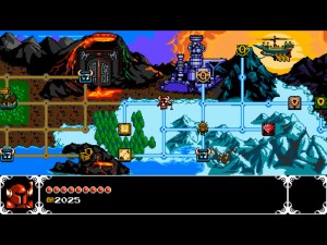
“Modern Retro” refers to games that either make use of an older aesthetic as a foundation for original game design (Hotline Miami, Titan Souls), or games made to mirror titles designed from back in the day (Shovel Knight, Super Hydorah).
Modern Retro design is one of the most popular among indie developers over the past decade (and even older than that.) The reasons why have to do with a combination of marketing, programming, and design.
What Makes it Popular?
Whether we’re talking about a first time designer or an established one, modern retro game design is appealing for a number of reasons.
From a design perspective, retro games provide a template to either use completely, or to grow your own game design off of. Classic game design is recognizable to a lot of people, and helps to reduce the learning curve when playing the game. If you build a platformer or FPS, you can be sure that most people who will play your game have a basic understanding of that design.
Without causing too big of an argument, pixel-styled graphics is generally considered to be one of the easiest aesthetics to build. Before any developers yell at me below, I know there is a huge difference between low and high quality pixel art. Continuing with that point, anyone who has done programming knows that a 2D-Designed game is vastly easier to build compared to a 3D one. You could also point to the fact that these games are less computer intensive compared to modern titles; opening it up for more people to play.
The final point is that modern retro games occupy that area of nostalgia for a lot of people. It can be a great experience to play a game that reminds you of your childhood.
While all those are great points, we have seen designers take things a little too far into the past, and presents us with the design trap.
Copying Homework:
The trap of modern retro game design is when a designer adheres to the retro design and aesthetic without any further development. I have lost count of the number of platformers, beat-em-ups, shmups, and action games that handled worst than the games they were trying to emulate.
In some cases, the designers will leave it at just the basic elements of the genre and that’s it. While retro games are on the short side, these titles could maybe have only minutes of gameplay at most. Some of the worst examples make no attempt at UI features or quality of live improvements; leaving the game hard to play and look at.
It often feels like the developers just looked at the game in question at the surface layer, without examining what made these games appealing in the first place.
There is an opinion that you should copy everything wholesale with classic game design, as that’s a part of the appeal, but I’m about to let you in on a little secret in the next section.
Classic Games Suck:
Classic Games have an appeal to them; it’s why they’re so popular and the reason for the success of GOG. With that said, it’s important to understand something: Classic Game Design has a lot of problems to it.
Most games from that era were limited due to hardware and the difficulty of programming games back in the day. From a design standpoint, developers were still trying to figure out how things worked, and there was no semblance of standardization among UI or game design.
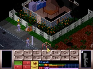
On one hand, it’s what led to so many original games, but on the other, this is why classic games are very rough to go back to today. I may love X-COM UFO Defense, but that game had a lackluster UI even for the day.
It’s important to point out that these complaints are not aimed at the people who worked on games back then, but just the nature of game development back then. The idea that game design could be something studied and that games would become a multibillion dollar industry was unheard of.
The question now turns to: Why do the best examples of modern retro game design work?
Putting in the Extra Effort:
Games like Shovel Knight and Cursed Castilla may have been designed around classic game design, but there was a lot more work done than just emulating the gameplay.
The titles that work the best when it comes to modern retro gameplay look to iterate and refine the design for modern audiences. With Shovel Knight, while it definitely looked and played like a NES platformer, the game featured numerous systems and gameplay elements that were not done back in the day.
While titles like Hotline Miami and Titan Souls made use of retro graphics, they were simply used to define the aesthetics and not limit the gameplay. From the previous section, if you want to talk about high quality pixel graphics, you could look at games like Hyper Light Drifter and Owlboy.
Whatever the case may be, there is a legitimate effort to go beyond just the classic gameplay and structure. That also has to do with the difficulty curve. Understanding the difference between challenging and frustrating difficulty is a major point and way too big to get into detail about now.
With each genre and design from the old days, it’s critical to be able to understand the best and worst aspects of them. Copying bad elements to try and emulate that old school feel is not good game design. A great game can stand on its own regardless of the genre and implementation, and relying on the “old school” crutch does not make you a good game developer.


