One area of UI design that I haven’t talked about yet would be the somewhat recent development of dual or multi screen UIs. At first, having multiple screens set up to run a game seemed like something for people with money to burn but the functionality is definitely there. Over the years we’ve seen this style transition off the PC thanks to Nintendo with the Wii-U and 3Ds and some of the best games for either platform make use of multi screen UIs.
Having the additional real estate to create your UI in may sound like it would be easier to design compared to a single screen UI; however with more screens come new challenges for the UI designer to take into consideration.
Defining Multi Screen UI:
Let’s start off briefly with talking about just what is “multi screen UI.” As computers became more powerful over the last decade, the ability to display more information than just on a single monitor became a viable option.
The first step is obviously a dual monitor setup where the user has them both side by side and gets the additional view to help them. But of course things have gone even further with multi monitor setups where someone could have four monitors running at the same time and I’m sure there are even more numerous setups out there. The use of multi screen design appeared off the PC with the release of the Nintendo DS and then carried on to the 3DS and Wii-U.

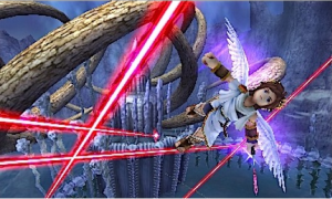
The 3DS is a great example of having two screens work in tandem with each other to produce one experience.
Now you may be wondering like I did back in the day this simple question — Why would you need more than one monitor/screen?
And that is a good point as most games are designed around the standard of a single monitor/screen. 2D game design for example used the single screen not just to design levels around but as the camera itself and the game would not work if you had an extra monitor or three.
But the advantages of a multi-screen UI do give developers some unique advantages that for many people are worth the added cost.
Spreading Out:
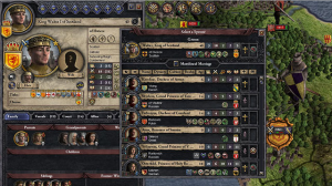
The advantages of multi screen UIs are built around increased functionality. First is that having the additional real estate lets you spread out UI elements that would have been constrained or required the use of layering screens (where the game has separate economy screen, map screen, military screen and so on.)
For games where the player has to jump between different screens of information, the benefit of a second screen can keep this relevant information in front of the player at all times. One of the first uses of multi screen UIs that I encountered, was having the map display in one of the DS Castlevania titles displayed at all times on the bottom screen.
Now you would think that spending less than a second waiting for that information to show up on one screen wouldn’t be a huge deal, but the accessibility of always having that information really does make a difference.
Another functionality use is keeping the main screen as clear of distracting UI elements as possible. Most of the statistical data for RPGs or action titles on the DS, found their way onto the bottom screen and left the top screen free to display as much of the game as possible. This made it easier to focus on the gameplay and not be distracted by UI elements.
Also being able to split gameplay and data up like this made it possible to have more strategy or tactical games on the 3DS compared to the major consoles where it would have looked awkward to split one screen into halves or quarters. The importance of having relevant information made readily available to the player when trying to make strategic choices cannot be understated.
And the last and most obvious advantage of multi screen UIs is that it affords the designer to really go nuts with coming up with unique games that simply couldn’t work on just one screen. Some great examples would be Knights in the Knightmare or The World Ends With You on the 3Ds of games with insane UIs and designs that could not work as well on one screen’s worth of information.
Again, having a second screen to do with what you want is great for game designers but you need to be careful with how far you spread things out.
UI Considerations:
Multi screen UI design doesn’t have a lot of cons to be aware of and most of it is just smart design. The obvious one is that you want to keep relevant information on the same screen such as the player’s health on the main screen. The player should not have to keep switching their focus while playing the game.
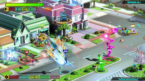
This is why a lot of games use the other screens to simply show information that supports the main action without taking the player’s focus off of it. For instance in strategy games like Planetary Annihilation, you could use a second screen to for either showing multiple fronts or a make shift mini map display, but you wouldn’t take unit and resources and move them off the main screen.
The 3DS is a special circumstance as the screens are close enough that someone could view both of them at the same time and why it gets away with being able to split your focus two ways. However, the distance between monitors or with the Wii-U’s gamepad and TV is far greater and you can’t shift your focus as easily.
On the Wii-U, it’s common in games that have important information split between the two screens to alert the player when to switch their view which typically happens when the player is viewing menu options or specific events.
Future UIs:
The big problem with talking about multi screen UI design is that it’s still a new concept and one that hasn’t been required to use outside of the Wii-U and 3DS. For those examples, every game is usually designed with a custom UI and there really isn’t any standardization yet among its use.
Games that make use of multi screen UIs mainly enhance what’s there but don’t add anything new which is obvious because giving someone an advantage with multiple screens would rub players the wrong way.
And until multi screens become adopted by the mainstream market and standardized, it will still mainly be used as a tool of the enthusiasts. This is also something that I think we’re going to see with the early adopters of the Rift when it comes out and based on its success, whether or not it will become a standard piece of hardware that designers can make use of.
I’m not done with talking about UIs as my next topic will be looking at layered UIs which are more widespread for PC game design.


