UI design is one of those criminally overlooked areas of not just game design, but anything where someone needs to make use of an interface. When it comes to video games, designers have the added problem of showing the player all the information they need, while still being able to show the gamespace to the player. For today’s post, I want to explore the concept of a Focal Point and what that means for properly showing data.
Focus In:
For this post, I’m going to define Focal Point as the following:
Focal Point: Where a player will be staring and the information that they can process when looking at different parts of the game screen.
It goes without saying that you want the player to be focusing on the gamespace of your game at all times: That could be the view of a monster coming at them to watching your army fight on the battlefield. However, there is only so much information that both you can display and that the player can process. Because of that, many game designers spread information around the screen, hopefully in relevant areas, so that things don’t become crowded and confusing.
In turn-based games, the player has all the time in the world to look around a screen(sometimes multiple screens) to figure out what’s going on, and the discussion on turn-based UI design is a separate issue and one we’re not going to talk about today. Instead, I want to talk about games that demand the player to be focusing on multiple areas at once in real-time.
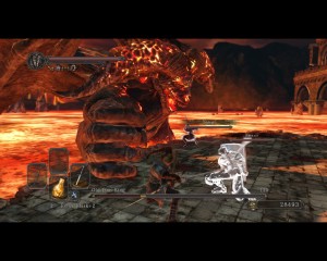
In most action games, a focal point will be your main character and the UI must be designed to accommodate that
One of the challenges of creating a good UI in action or real-timed based titles is that the more elements you have on screen, the more things that will take the player’s focus off of what’s going on.
When building your UI around the fact that the player is going to be constantly shifting their attention, it’s important to understand how the Focal Point will change during at any given time.
Shifting Views:
The Focal Points that the player will be looking at are based on major areas of information in your game. The first one is obvious: The on screen character itself. In any game where your character is represented on screen, the player will focus on them. This is why in a lot of games the main character will take up the bulk of the screen or be the biggest presence, because the player is going to be focusing on them.
Due to this focus, UI status elements need to be carefully placed: They have to be big and detailed enough so that the player can see them, but not so big as to distract from the character, and finally not be so small that the player has to search for them in the heat of the moment.
This is why most developers go with one of two options for how best to show this information. The first is creating a bottom pane of information with the most important elements like health and mana the more prevalent. Second, is to show vitals to the upper left or right of the character.
I want to stay on that second one for a second, as the reason why is quite interesting. When the player is focusing on a character on screen, such as in the Souls series or action games like God of War, their focus is going to be straight and looking slightly up. The reason is that due to how the camera is framing the action, this view point lets them see the main character and be able to view the situation around them. Their view lets them see the character, to the left or the right, and above easily with their peripheral vision.
In this way, the vitals can be seen without the player having to take their eyes off of the character and incoming enemies. Imagine for a second, if Dark Souls went with a Diablo styled framed UI for its vitals with everything below the character, it would completely change how someone would view the action.
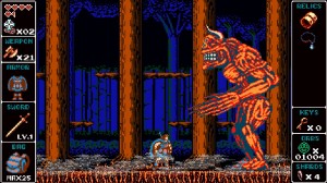
Odallus did not go with a traditional UI, but framing the UI this way actually made it easier to focus on the status panes and the character at the same time
Another thing to keep in mind, when the player is focusing on an onscreen character, their peripheral vision will let them see useful information to the left and right of the main character, not so much to the extremes of below or above.
One of the best UIs I saw was for the game Odallus the Dark Call by Joymasher. Instead of going with a traditional top or bottom frame of the UI, they did a side frame so that the gamespace was directly in the middle of the screen.
This way the player could focus on the on screen character, while their peripheral vision was able to easily see the information to either side of the player.
While the main screen is important, you shouldn’t discount any status displays or elements while you are building your game.
Lining things up:
When we talk about strategy or ARPG titles, the player needs more information than what can be provided on the game screen. This is where status panes and other UI elements come in to help give the player more detail about what’s going on. With that said, there are some elements that you need to know when putting together these supplementary areas.
The first should be obvious: There should not be any status elements that are more pronounced or stick out compared to the gamespace; it’s distracting and will do more harm than good over a lengthy play period to annoy the player. Another part is that the status elements should be designed that the most pressing information should be the easiest to pick out; this is why health bars are usually giant orbs or big bars. The more important the element is, the bigger it should be on the UI, and you can design elements getting smaller as you get to those that are the least important.
Another important element goes back to the concept of framing elements. If you look at any game that features two or three different elements on the game screen, such as the gamespace and a UI pane, you’ll notice that they’re positioned in a specific manner. Games that have the best and easiest to follow UIs, will position UI elements along lines on the screen. You can see this in almost any video game; how UI elements are set up horizontally or vertically along an imaginary line, so that everything remains straight on the screen.
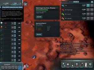
Offworld Trading Company’s UI featuring multiple focal points due to how the UI elements were set up, which leaves it looking very cluttered and unorganized
The reason has to do with how we process information and I can’t find any scholarly pieces of information right now on the topic, but there have been studies done to show how framing information among symmetrical positioning allows us to process things better.
If you have a UI that is broken up, either with asymmetrical elements or the UI not being framed, it’s going to look cluttered and harder to process; or in other words, the player is going to be constantly shifting their focal point to make sense of what’s going on.
Another consideration is that if you have two panes of status information areas, they should be symmetrical to each other to once again produce that framing effect.
Offworld Trading Company is a good example of what could go wrong with UI design, at least from the early parts of the game’s release on Early Access that I played.
The problem was that you didn’t have one or two UI elements, but five: The market and inventory section, the gamespace, the stock and company info section, the special buildings and upgrade HQ part and the special powers section. Each element is set up on different parts of the screen with major spacing between them, making the whole thing feel segmented and cluttered. During my time playing Offworld, I ran into multiple cases where I missed vital information on one UI area, because I was focused on what was going on somewhere else.
This is why many games that feature pop-out elements, will still do their best to leave things symmetrically for the player to be able to still process things effectively.
Eyes on the Prize:
Again, UI design is not something that we’ll be able to cover everything about in just one post. You should now have a clearer idea as to why framing information is so important, and to avoid esoteric or jumbled up UIs for your game. There is one other major UI topic that I want to talk about: Seamless UI design and how designers have been removing UI elements while still preserving the information. That will be the topic in an upcoming post, so stay tuned.

