Besides analyzing video games, I’ve had a chance to look at web sites when it comes to video games and game news sites, and there is a lot not to love about them. When I sat down with my web designer to design Game-Wisdom, we looked at a lot of sites to figure out what they did wrong, and today, I want to share some of the annoying trends that are hurting these sites.
Before we begin, this list is not going to be organized in a worst/most important way, and not every one of these applies to both game and game news sites, but these should be red flags for anyone with a website that has to do with the video game industry. To protect the guilty, there won’t be any mention of actual site names or screenshots for this post.
1. Anti Virus Warning
Video games are an exciting industry and many people feel that “going loud” is the best way to present their information. I think you all know what game news sites I’m talking about here; sites where it looks like something you find when you accidently type in the wrong spelling in your web address and you get taken to some strange site full of colors, ads and mismatching fonts.
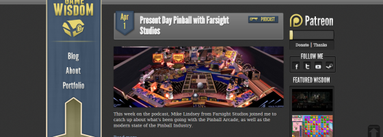
When we were coming up with Game-Wisdom, my web designer and I were in complete agreement to avoid anything like that with the site design. First, it looks unprofessional and something that a kid did. Two, it’s impossible to find any useful information on it. And third and most important, it looks like a site that anything I click is going to give me a virus on my computer.
I know sites are trying to stand out from everyone else, but can we move away from the “Modern Art” design philosophy soon? Regarding presenting information, that takes me to point two.
2: Hide the Info
This one is something that both developers and news sites are guilty of: Making it a pain in the ass to find the information you’re looking for. I should not have to spend more than 30 seconds to find a press contact on a site, period. And yet, so many game sites either don’t have press information available, or it’s hidden in some corner of the site that no one would ever find unless they wanted to dig through your entire site.

All information relating to Game-Wisdom can be found on all sources; making it easier for people to stay connected
Recently, it took me about 10 minutes to just find an email to contact a game developer for a press copy of their game. I had to search the entire game site, then the developer site, and finally found something on the publisher site with a link.
In another case, the company literally didn’t have a press link set up; I had to call the corporate office to get an email that hopefully will work.
Another point regarding this is when sites try to get “cute:” The site features custom graphics or some crazy design that makes it stand out, but makes it impossible to find anything you’re looking for. Every game site should have on their main page a way for both fans and press to get in touch with you. Also, even if you are dealing with a publisher to handle things, it’s still important to have your own email address and contact page; you never know when a publisher may let an email slip through the cracks or if the person finds your site first.
One common theme I see about sites that work is having a separate “Press Page” on their site; this page has all the contact information, game information, screenshots and videos, and basically anything that someone would need if they wanted to write a piece about the game.
Another issue I see with game sites in particular is over/under compensating for their site. What this means is the company will create a separate site for each of their games and fill that with any and all information, but then their company site will be bare-bones and may just have a title page and that’s it.
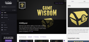
If you look at Game-Wisdom, everything I do links to everything else: If someone finds me on YouTube, they’ll get information about Twitch and the site; if someone finds the site, there’s information about YouTube and Twitter and so on. The point is this: It’s important to have a unified front for your company and brand, so that no matter where someone finds you, they’ll get all the information they need.
With news sites, you should have a working search bar and contact information available on the front page. If you’re a news site, there should be a way to contact you front and center on your site; too often, I see news sites with that information buried under two or three pages of finding a contact page somewhere on the site.
This next point is one that focuses more on news sites, but larger game sites or companies can also mess up here too.
3. Community Building and Features
Many game news sites are now trying to focus on building a community of readers and content contributors; that means having public blogs, means for people to stay connect and more. Despite that, I had a good laugh with a friend and contributor to Game-Wisdom as we talked about how horrible game sites are on this front.
First and foremost, if you’re going to allow people to set up public profiles, then you need to have ways to send private messages to and from. Second, for people with blogs, it’s absolutely required that you have the option to receive updates when people post comments on your blog and respond to yours.
In terms of the sites themselves, many feature different blog editing software used to keep the posts within the same style as the site itself. Every post editing section should have the same basic functionality: Allowing for hotlinking, posting screenshots and captions, easy copy and pasting functionality and setting up screenshot and text alignment.
For game companies, it’s useful to have some kind of a forum set up for fans to ask questions and get in touch with you in a general atmosphere. If you’re not on Steam or a digital platform, then you should set up something on your own site. However, once you get on Steam and have a community set up, you need to be active there.
For both game sites and news ones, this last point should be obvious, but if you have video content on other sites like Twitch or YouTube, you should include a link to it somewhere on your front page.
Wrap Up:
These are just the basic points I’ve ran across, and I’m sure that for people reading this, you probably have more examples. If your game site or news site is failing in any of these categories, then there is a big problem with your web design. For developers reading this, while it’s important for you to make an effort to reach out to press, it’s just as important to have a site where press and fans can easily get in touch with you.
There are too many games being released these days to expect people to go Internet hunting to get in touch with you, and you’ll never know how many contacts and potential fans you’re losing out on either.
If you enjoyed the post, please consider donating the Game-Wisdom Patreon campaign. Any donations will help keep the site ad-free and allow me to continue putting up great content.


