For this first of several posts aimed at providing important lessons and tips for game designers, we turn to control design or layout. Good controls are an understated part of what makes a game work; if a game’s controls suck, I immediately stop playing it. Coming up with a layout that works can be tough whether you are on a keyboard and mouse or gamepad layout. In this post, we’re going to talk about one of the first things you need to understand when coming up with UI design.
Neutral Position:
As anyone knows, there are certain standard ways of holding a gamepad or having your hands on a keyboard and mouse: On a gamepad, we keep our hands where the thumbs are on the thumb sticks; on the keyboard, our left hand mostly stays on WSAD and our right is on the mouse (unless the game is keyboard only.)
With these two positions, we can define what we’ll call the neutral position.
Neutral Position: The position where the player’s hands are to perform the main actions of your game.
The main actions of your game should be simple: What is the player going to be doing the majority of the time? Are they shooting and moving, running and jumping, point and clicking for attack and motion? For this post, we’re going to focus on action-based games compared to turn-based, but there is one thing we can talk about. In turn-based games, the neutral position is where the player can reach as many important hotkeys while still controlling the game normally.
The important part for you to understand as a designer is the fact that you passively set the neutral position by the layout of your game. While it is vital to have control mapping functionality, a hallmark of a great designer is the ability to define a control scheme that works for their playerbase. A sure sign that you have messed up is when the player has to literally reconfigure every key on your game.
When setting up a neutral position and then extrapolating that out, there are several things to keep in mind.
Within Reach:
The first thing you need to understand is that once a neutral position has been established, the remaining controls or mechanics in your game have to be built around that position. Nothing screams a novice game designer more to me than one that sets controls all over the keyboard or tries to build some crazy scheme on a gamepad.
Let’s say for your game that my left hand has to be hitting WSAD constantly to move my character and the mouse to aim, don’t set up other commands on the jkl; side of the keyboard; how the hell is the player supposed to hit them?
While the Function keys can be used for special commands or Quality of life features, they should never be assigned common or constantly used commands.
Gamepads are usually easier to design with, as the locked layout prevents a designer from getting too crazy. Still, you need to be aware of where the player’s hands are going to rest when playing.
That takes us to the major point of a neutral position; the game designer has failed with their UI layout if the player has to shift their hands away from the neutral position at any time during play. Let’s say on a gamepad that the command to attack or block is located on the left D-Pad while motion is controlled by the left thumb stuck.
The problem is that in order to perform this command, the player must shift their left hand away from controlling movement in order to hit it.
Essentially, you want to watch out for any commands that stop the player from performing other commands while they’re doing it. Another thing to be aware of on the keyboard is to have different commands too close to each other. While you can have the keys for health and mana potions next to each other, don’t put the “punch a NPC in the face” and the “give them a gift” commands next to each other.

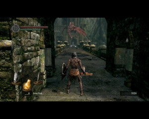
Despite being button-heavy, the UI for the Souls series did a good job of presenting an effective neutral position for controlling the character
Keep in mind that if the player is performing one action constantly such as movement, you want to try and avoid adding commands near the hand that is controlling motion.
For instance, if I’m using WSAD for moving a character around and dodging attacks, putting commands on the number keys above will be very hard to hit, because they would require me to shift my hand up and off of WSAD.
However with that said, it can also be useful to keep relevant commands near the same hand; IE: Don’t put the attack, block and evade buttons in three different parts of the keyboard.
Getting a Good Flow:
When a designer gets the UI correct, it can make playing the game become second nature to the player and is a sure sign of a well-designed UI. This is one of those things where the only way you’re going to know for sure how your game is played is to actually play it and let others play it as well.
While this post may be on the shorter side, we’re not done talking about control schemes and UI. In a follow up post, I’m going to talk specifically about the philosophy and implementation of context sensitive controls.
If you enjoyed this post, please consider donating to the Game-Wisdom Patreon campaign. Your donations help keep the site ad-free and allow me to put out more great content.


