Over the last decade, there was a major push to give video games a more cinematic feel compared to the previous decades. This was seen both in terms of story/narrative and UI. Many developers have been streamlining UIs in an attempt to remove the “gamey” elements from them. For today’s post, I want to explore the concept of a Seamless UI and ways developers have been “trimming the fat,” while still keeping the functionality.
Seamless UI:
When looking at elements of Seamless UI design, this isn’t a black or white feature like other mechanics and systems; its components or a different way of designing a UI, as the definition will go into detail about:
Seamless UI: Removing hard elements of your UI in favor of having them directly within the gamespace or character
Basic UI design is about creating a frame of information around the gamespace; allowing someone to easily see important elements about the character and what’s going on. In many cases, developers take this further with a second UI built into a status screen or game menu. While all this information is useful for the player, they do become a distraction from the gamespace as they are surrounding it and it takes the player out of the experience. The issue is that for the player to get any information about what’s going on, they need to look away from the gamespace which takes their focus away from what’s happening at the moment.
What a Seamless UI does, is that it takes pieces of UI information that would have normally been displayed on screen and puts them directly into the gamespace; or in other words seamlessly into the game.
Instead of having a screen filled with bars, numbers, graphical icons etc, the gamespace itself shows this information through the character or in game graphics.
In this way, more of the gamespace can be shown on a single screen and it becomes a lot easier to process the information when it’s directly in the player’s view.
As I said further up, this isn’t an on/off concept; many developers use different degrees of Seamless UI design in their game when it’s appropriate. Our first example is one that has almost become a standard of design itself.
Health:
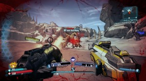
Health has always been an abstract concept in video games since the arcade era; how do you correctly represent the amount of damage a shot from a rocket would do or being lit on fire? One of the most popular forms of Seamless UI design has been using the screen itself to represent the player’s health. Chances are everyone reading this has seen games where the screen flashes red or changes color when the player is about to die, that is an example of a Seamless UI element.
The player never has to turn away from the gamespace to check their health, as it’s always being displayed either passively with a clear screen or explicitly when it’s flashing red. This has also had the side effect of being coupled with the transition away from static health points and recovery, in favor of regenerating health. It’s a simple trick that eliminates what would have been a distracting UI element from the game.

Many FPS these days use the screen itself to represent emergency situations about the player’s health.
A cheaper way to get the same effect is to have a health bar or health status, but only display it when the player has taken damage or is recovering health.
While it’s still a distraction from the gamespace, it’s one that isn’t always in front of the player. We can also see this with games that show weapon and ammo info and having it disappear if the player is not in a combat zone.
Another variation of this is having the player model change how it moves and looks based on the current health status. A character that is fine will walk confidently and have no scratches on them. Meanwhile, someone who is about to die will have their clothes ripped and will limp around ready to collapse.
Taking it further, some games have gone with a full immersion UI when it fits the situation the best.
Built In:
Seamless UI design has a limitation depending on the genre and the amount of work the designer wants to put into it. In games set in the future or sci-fi setting, we’ve seen developers embrace it to create fully immersive UIs that are seamlessly built into the game.
Most often this is done by integrating the UI into the gamespace in such a way that it almost exists within playing the game, instead of being outside as a frame. While not set in the future, in Metal Gear Solid the Phantom Pain and Ground Zeroes, information overlays are fed directly into the game space and the player can pull up a real time map at any time to see the current situation.
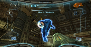
But the two examples I want to talk about went with having no UI that is separated from the game. The first is the Metroid Prime trilogy by Retro Studios. The series takes Samus Aran and puts her into a first person shooter/adventure game. What the developers did was build the UI as a part of Samus’s suit; allowing someone to get all the vital information about what’s going on and the current situation with it.

The Metroid Prime trilogy integrated all UI elements into Samus’s HUD and make for a very immersive experience
While the game does pause to pull up a full map, the regular view gives the player details on Samus’s vitals, current weapon and ammo, basic map of the area and more via visor information. As an added bonus, this allowed the designers to purposely hide parts of the gamespace to represent Samus’s limited field of view from her helmet.
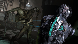
The second example is the Dead Space series and just how brilliant the developers were at creating a seamless UI. How it worked was that the main character himself became the UI; showing all important information directly through him. The player’s health was represented by status bars displayed on the spine.
Pulling up any weapon to aim would also display ammo and each weapon had a different targeting reticule. Instead of pausing the game to take the player out of the action, all in-game menus and information were shown as a 3D hologram that the player could pull up at anytime, including handy points to guide the player directly to the next objective. All this gave the player important information without taking them out of the experience.
As an added bonus, because the game never stopped for the player to do something, this added to the tension as enemies could attack the player while they were busy looking through their inventory. As with our other seamless UI examples, this gave the player a completely clear gamespace to admire the game and get pulled into the world; without having UI information popping up and taking them out. Another game that came close to the same level as Dead Space was the Ghostbusters game; however they did take the player out of the experience for upgrades and other information.
One thing to note about Seamless UI design, games that have no UI elements on screen, but keep that information on a secondary status screen, are not full immersion examples of being seamless. Games like Amnesia and other narrative based titles do help pull you into the world by not having a UI on screen, but they still make use of hard UI elements when designing their secondary screen.
Cinematic:
Seamless UI design may be hard to pull off at its highest level, but even simply putting health and ammo information directly into the game can do wonders for making your game look better. It’s important to note that Seamless UI design doesn’t really work with strategy or turn based titles, because you want to give the player a lot of information about the current situation. Another example where Seamless UI would be difficult to implement is when games feature context sensitive controls, such as the Assassin’s Creed series and recent 3D Zelda titles.

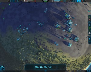
Seamless UI design is great for cinematic games, but not so much for strategy games or ones where there is a lot of information to give the player
The problem is similar to turn-based games; you need to keep this information on the screen so the player knows what their options are.
Metal Gear Solid 5 went with a half-an-half solution; context sensitive actions would appear in the gamespace when they were relevant to the player’s current situation, and disappeared when they weren’t.
But for games that are real-time or trying to tell a deep story, the less distracting elements you have on screen, the better. In fact, figuring out how to display this information directly on the gamespace can help you improve as a designer, as you’re making an effort to create a more intuitive UI.
At the end of the day, Seamless UI Design follows the old adage: “Sometimes less is more” and is a possible solution to help make your game more cinematic.


Pingback: 9/28/15 – Developers, Tutorials, Emotions, UI fat, and Morals | Game Design Digest()