Today’s post on UI design takes us to one of the bigger quality of life features you can add as a game designer. Games built around multiple systems and screens of information can become very daunting for players to go through in an attempt to learn what’s going on. The problem is simple: How do you figure out what’s the important information out of everything on screen? The answer is the use of Smart UI design and how it helps a player by cluing them in on what’s important.
Relevancy:
Smart UI design is a simple concept that requires a lot of work:
- Smart UI: UI elements that frequently update based on what the player is doing or the current situation
Most UI elements are static and are designed around one task: Display player health, display ammo, show current resources, etc. What Smart UI elements do is that they will change what they show or display based on the current situation or needed info. The simplest example and one we’ve all seen is the enemy display UI element. In just about every game, there is an UI element that updates to show the current target and their vital stats. RPGs, FPS and even the information pane in strategy games are an example of this.
While this is the basic form of it, we can go a lot deeper with smart UI design. Let’s say we’re trying to equip a group of NPCs with a variety of gear from our inventory. The smart UI elements would only display relevant gear based on who we’re looking at for instance. Another example, let’s say we’re building a city and we need to decide what buildings/resource producers we need more of. By mousing over the building in the construction UI, the game will display how many resources of that particular resource generator we have coming in and going out; without needing to go to a resource management screen.

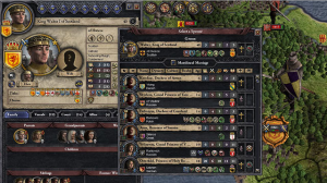
Strategy games are very hard to learn, because they normally throw everything at the player with no way of filtering out the non-pressing information
The key takeaway about smart UI elements is that it allows the player to get the information that they need and based on the current situation without having to go to a separate set UI element in-game.
You can still have those hard elements in-game, but the information will be displayed in relevant areas that the player is looking at.
By using smart UI elements, it makes the game as a whole easier to learn, because the player is being shown the information they need when they need it, instead of having to dig around through the other UI elements for it. This also makes the UI a lot more elegant and by only showing the relevant information, you can have less hard UI elements on screen while still giving the player all the information they need.
This all sounds wonderful and amazing, but I’m sure you’re asking yourself this question: If it’s so great to have smart UI elements, why doesn’t every game have it? The problem with smart UI elements is that for all the good they do in making the game easier to learn, they make the game a lot harder to build.
Linking Information:
Smart UI elements require three key pieces of information to work properly: What’s the player looking at? What elements in-game are related to it? What needs to be displayed right now? This means you need to design elements that not only show information, but know what to pull from other systems and to change base on the situation at hand.
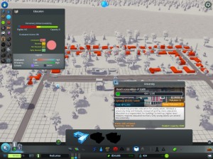
In Cities: Skylines, while the player can go into the UI to find information like education, health, crime etc, the game features smart UI elements that work to break that down based on the situation at hand. For instance, let’s say I want to build a new fire station, while I have the fire station construction menu out, the game shows me, what parts of the city are being covered? The current fire risk and where are my current stations located? And for every other municipal service, the same things.

Cities Skylines featured a smart UI that showed the player all relevant information when deciding to place new structures down, making it easier to learn and follow what’s going on
This is a good example of the challenges of smart UI design. As the developer, you need to know not only what information the player is going to be looking for, but also what information is related to that specific task?
Going back to the Cities: Skylines example: Let’s say they also showed police reports while looking at fire; that wouldn’t be relevant and would confuse the player.
For smart UI elements to work, you need to get inside the player’s head as well as your own design to figure out how everything is connected.
From a programming point of view, there are obviously hurdles to go over, but I’m not a programmer and I can’t talk from a point of having first-hand experience on this topic on that front. At a high level thought process, you need to design UI elements that can check for what screens are open at the moment and are able to use that information to change what is being displayed onscreen.
Crystal Clear:
Smart UI design makes it a lot easier for someone new to learn how a game works and can help greatly in terms of streamlining the design, leading to a cleaner looking UI. While not every game out there needs smart UI elements, for multiple system games such as RPGs and strategy games, this can help make it much easier to explain new systems and mechanics; by only focusing on what matters at this specific moment.
One of the big problems with strategy games in general is the fact that everything is displayed at once to the player, making it hard to focus on the present situation. Smart UI design eliminates that, by only letting the player see the information that is pressing to the situation at hand. While it may be additional work, being able to make a complex game more accessible can help out in the long run, and earn you new fans in the process.


