When it comes to PC game classics, X-Com UFO Defense stands tall; over 15 years old and still highly regarded. From its use of multiple game systems, to an amazing dual progression system, it’s a game that people can still play today. However, while X-Com is a prime example of great game design, it’s also an example of poor UI design.
Before I get started, I just want to make the following clear: I’m not attacking the gameplay of X-Com. To be fair to the game, the problems with UI could easily stem from the fact that this game was made during the early days of PC game design. Both technology and design theory have evolved drastically. None of the issues mentioned in this post should deter anyone from replaying X-Com, as the design still holds up today. With that said the issues with the UI are universal and are important points for designers today to be aware of.
Screen Switching:
Both Strategy titles and RPGs are about making multiple decisions: Deciding what units to build, equipment to wear and so on. In order for the player to make informed decisions, they of course need accurate information to go on.
This UI misstep is when designers spread out information and the decision between multiple screens. What happens is that it’s cumbersome having to go back and forth between several screens to accomplish one task. What can happen is that with all the details involved, it’s easy for the player to forget them while switching, causing more frustration to the player.
In X-Com one of the most important decisions the player has to make is what squad members to take on each mission. Each person’s attributes are randomly generated at start and are increased as they survive battles. Time Units or TU are important as the more the person has, the more they can do during each turn, along with the bravery stat and another one that comes into play later on.
The problem with X-Com’s UI is that to make this decision, the player has to go through 5 screens to make it:
1. The soldier info screen showing a list of all members.
2. Each individual’s attribute screen.
3. The hanger where the vehicles are located.
4. Selecting the troop transport and then available spots for squad members
5. Assign people to the ship.
While the complete set of actions would take a normal player about 5 seconds to go through, that series must be repeated every-time the player wants to decide who take on a mission. Unless the player has the information written down somewhere else, or has a good memory, they’ll have to repeat it several times when assigning multiple people.
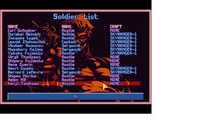
What makes this such an unusual problem has to do with the design of the screens. Here is the screen where players’ select squad members to examine for step 1:
Now here’s the screen where players assign squad members to the ship in step 5:
Notice any similarities? Both screens share the same design and have a lot of unused space. The red circled area would have been a great place to put a button that would link back to the attribute page, or for step one link to the ship assign screen. Besides quick access to relevant information, another solution is to repeat the information that is important on multiple screens.
As an example: Equipment swapping is common in RPGs, both from a store screen and from the player’s own equip screen. Due to the rate that players would replace gear, its common practice to repeat the information relating to the equipment attributes on each screen. This allows the player to quickly see how the new gear stacks up to what they are currently wearing. Incidentally this is also a minor problem X-Com, as to view the stats of new equipment, the player has to visit the ufopedia and then head back to the equipment screen to designate what items should be put on the ship.
To decide what information to repeat and where can come from play testing. If you notice that there are some actions or screens that you are repeating constantly over the course of playing, it would be good to find a way to condense the action down The best ways to condense would be to either repeat the relevant information or provide a quick link to it if it’s not possible to fit it on the screen.. By doing this it will streamline the UI and not waste the player’s time with unneeded actions.
Foreign Symbols:
Symbols are an important part of human comprehension. They allow the human brain to remember their purpose easier and can be used universally. For instance: In the US, we all know that the color red on an octagonal sign means to stop.
The other use is that a symbol can condense information down making it easier to understand. Instead of a sign giving a worded warning about radiation, the radiation symbol can be used to allow someone to quickly see and understand.
Due to the # of interactions and mechanics in a strategy game, symbols are important to prevent the player from being overwhelmed by information. But the problem is that every strategy game features its own unique mechanics which means having a different terminology for symbols. One game may designate magic attacks with a blue sphere, while others may use a star for example.
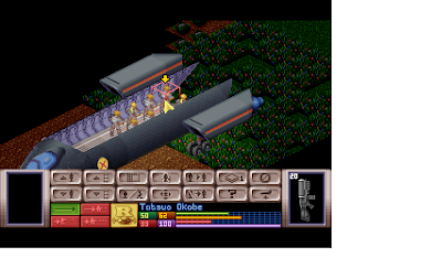
During X-Com’s turn based battle system; the player uses a different UI. The problem is that the designers created a bunch of symbols that are unique to the game:
Looking at those symbols along the bottom of the screen it’s hard to tell what exactly the function of each button is. Fortunately, the issue of confusing symbols has one of the easiest solutions in the form of tool tips. A simple description that pops up if the player hovers over the icon for a few seconds. Some strategy games go a step further with advanced tool tips, where if the player hovers for a few more seconds, more information is displayed.
UI Design is a tricky concept as you won’t know how everything will flow until you are playing the game. Creating an easy to understand UI is important to learning Strategy titles due to the variety of rules and mechanics involved. The last thing a designer wants to happen is someone being completely overwhelmed by screens of information. If playing a game about being a king during the medieval era, is more complex then actually being a king during that time, then someone has some streamlining to do.
Josh Bycer


