For this short series I want to focus on some of the common mistakes I see indie game designers make. As we’ve talked about, Indies have the advantage that they are working on their own without a publisher intervening. However this means that these developers have no one outside their fan base or themselves to examine their games and this can lead to some rookie mistakes making their way into the final product. And for this part, I want to talk about control schemes that don’t make sense.
Crazy Controls:
A well designed control scheme in my mind can make or break any title and the art of developing one is too big to talk about in this post. Its one part design and one part the feel of your game. For complex games like strategy titles, UI design can also fit here.
There are several areas where an Indie designer can either make a mistake or go down the wrong path of reasoning when developing their control scheme and these words of warning are universal across almost every genre. And interestingly enough, these are issues that many classic developers made at the time simply because no one knew better.
The first is the all keyboard consuming scheme where the player has tons of keyboard commands to use. In the early days before context sensitive controls or shortcuts like the mouse wheel, designers had to assign every command its own key. And the brilliant idea at the time was that it would be easier if you just used the first letter in the word as the key to use it.
So you would have your flashlight set to F, accessing notes with N, eating food with either E or F and in the case of two commands having the same beginning letter, one would either use the next letter or just some random letter. There are two problems with using the letter control scheme and the first one is that it becomes confusing fast.
The second issue is that when you have keyboard commands all over the place, it can become unintuitive or uncomfortable to play your game when you have to constantly shift your hands across the keyboard.
This is where context sensitive controls can be a god send, as you can still get the effect of having multiple forms of interaction but without having multiple controls. Another part is understanding where the player’s hands are resting on the keyboard and making sure to have important commands close to or at their position for easy access.
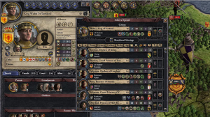
The reverse of this issue is the “screen dump:” where all controls, commands and systems can only be accessed via on screen buttons. This is mainly seen in RPGs and strategy games that have enough commands to fill most of the screen up. While the mouse is a great tool by itself, you can’t forget that anyone who has a mouse will most likely have a keyboard to go with it.

Screen dumping information can leave a new player confused as to where they need to be focusing their attention on
Keyboard hotkeys are great for speeding up actions and freeing up the screen.
One of the biggest dissuaders of playing a new game is loading it up for the first time and being immediately assaulted by commands all over the place.
This can lead to the “deer in the headlights” situation that I bet most of us have had at some point.
Build a Scheme:
The next design no-no revolving around control schemes is bucking conventional control scheme design for your genre. It could be making a first person shooter where the player has to press the H key to fire a gun or a platformer with the jump command tied to the U key.
Maybe the designer doesn’t know any better or they’re trying to be “cool” and “edgy” by making their own control scheme to stand out. The problem is pretty simple: You do not want your game to stand out when it comes to your control scheme.
The last decade brought a major shift of accessibility towards game design and one part of that was the standardization of controls. This is why games of the same genre use the same basic control scheme — It makes them easier to learn, cuts down on the need for tutorials and in many cases one scheme is really just the best one for that genre.
Case in point would have to be trying to play through the first person survival game of Miasmata. The control scheme was made up of a bunch of commands throughout the keyboard and just felt very awkward to play and became frustrating fast. What makes your game unique should be the gameplay, not having to figure out some esoteric control scheme in order to play it.
Trying to play through Surgeon Simulator 2013, the developers set up the left hand controls with finger commands on two different keyboard lines in order to simulate the heights of fingers. Where they could have made it more comfortable to play by just keeping all the keys on the same row and it would still have the same effect.
This is where playing other games that belong to your game’s genre is important to get their feel. Years of playtesting have been put into figuring out the easiest to learn control schemes for many genres and you should not let all that go to waste. Despite the split between AAA and Indie developers, Indies can learn a thing or two from AAA games of the same genre.
AAA developers spend a lot of time figuring out the right control scheme for their game based on focus groups and playtesting. And using these tested control schemes as a blueprint for your game can give you a great starting point for fleshing out your own scheme.
One final point is that if you’re designing something like a platformer or 2D game; make sure that it has gamepad support. 2D titles work better with a gamepad compared to a keyboard and mouse and you shouldn’t just ignore the hardware.

When it comes to 2D games on the PC, gamepad support is very important for getting that high degree of fidelity.
Understanding feel and flow of a 2D game is a major point and one that is just too big for this piece, but feel free to read my piece on floaty control schemes for more on this topic.
Control design is something that you can’t just come up with on the fly and requires play testing to get the feel right for your game.
And nothing screams “new designer” than having an overly complicated control scheme. As a recurring theme for this series, the Game Industry has gotten so much bigger over recent years thanks to the rise of mobile and indie markets. And because of that, you really need to make sure that your game has a strong footing as major problems will quickly drive people to other games in their backlog.
For the next part, we move from designing your game to actually selling it and the latest marketing tactics that are proving effective, for better and worse.


