La-Mulana: Unearthing Frustration


Recently I’ve been getting acquainted with the game: La Mulana – A 2d open world platformer adventure title. Or in other words: A metroidvania on steroids.

Having spent a week playing La-Mulana, I don’t think I’m going to be solving its mysteries any time soon… unless the solution involves uninstalling the game.

La-Mulana

Treasure Hunting:

The story of La-Mulana is that you are on a quest to unravel the mystery of a mysterious temple that your father discovered.

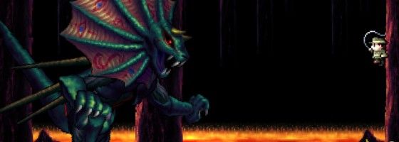
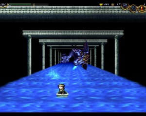
As you can see from the screenshots, La-Mulana is definitely old school in the graphics department. But the game does pull out some nifty tricks for the boss fights.

The gameplay is the heart of La-Mulana’s excitement and frustration. The design is open world, allowing you to explore almost everywhere from the start. The temple is split into different sections, each with their own enemies, puzzles and treasures to be found.

Treasures are very important in La-Mulana, as each one will grant you some kind of upgrade: new weapons, equipment or simply a health boost. Opening up treasure chests requires you to solve a puzzle which can come in many forms. The game throws clues at you through tablets to try and guide you to the general conclusion, but expect to have more questions than answers.

La-Mulana

While the game is 2D, the boss fights showcase some visual flair.

If the puzzles weren’t challenging enough, La-Mulana features plenty of tricky platforming segments.

La-Mulana‘s jumping system was largely committed base: meaning that once you performed a jump, you were committed to the trajectory set out.

You can make slight alterations in mid air, but nowhere to the degree of modern 2d platformers.

Each area of the game also had a boss fight that required you to solve a number of puzzles in the area to unlock. These creatures were always huge in stature, requiring careful movement and attacking to take them out. The careful movement part however was more trouble than it was worth, which I’ll be coming back to in a minute.

What La-Mulana gets right was really delivering on the concept of taking a metroidvania type design to the nth degree. For people who want an action adventure title that lets you go off the chain and do what you want, La-Mulana is perfect for you. However, La-Mulana‘s design was frustratingly old school and lacks the polish to really elevate the title.

A Deadly Game of Hide and Seek:

The problems with La-Mulana’s open world design were not readily apparent from the get-go. And for the first few hours, it’s easy to declare La-Mulana an amazing game and leave it at that. But the further you get in, the challenge of the game gives way to frustration.

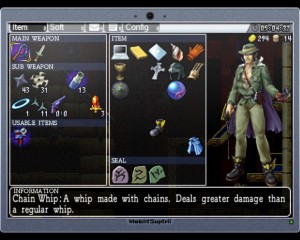
Solutions to puzzles were not always near the puzzle, or even in the same area requiring you to back track through areas to find what you need. Even solving a puzzle was not always readily apparent, as I had cases where I did something in one room that solved a puzzle in another room without any clue that it was the solution.

Later puzzles may require you to do something in a completely different section or find an item that the game may only give an esoteric clue about. For instance in the first section, I was moving through the area activating switches and without knowing it, I solved the “grand puzzle” that unlocked the boss fight.
La-Mulana

Items are vital for making any form of progress in the game. Too bad that figuring out said progression is a frustrating ordeal.

To make things worse, the game falls back on the always frustrating: hidden walls and secret rooms for progression and hints.

You can find clues to secret rooms as you get further into the game, but you’ll be dealing with them a lot sooner than that.

The game tries to be clever with forcing you to explore for solutions, but there is a difference between being clever and just being frustrating. There are many cases where the player may just wander around a section not knowing if they missed the solution, or if they need to come back later.

The tablets that you can find swing between clues for a puzzle and flavor text, but it can be hard to figure out the signal from the noise.

When I finally reached the point that I was done trying to piece the game together and starting to watch a walk-through for hints, I never thought to myself ” I can’t believe I missed that” but instead “that was the fricken solution the entire time?!” There were several situations where the trigger for the next puzzle had no relation to the actual puzzle itself.

Another annoyance were “holy sections” where a blue eye will shock the player if they perform an incorrect action. The problem was that said action was different for every room. One time you may get shocked for incorrectly hitting a switch, another time it will because you swung your weapon in mid air.  Dying because of an arbitrary inconsistent mistake is just poor design.

La-Mulana from some of my friends, described it as a 2D take on Dark Souls, and I can see the comparison, but the big difference is how they handle progression. In Dark Souls, while the entire game was open from the start, the only limiting factor was the player’s skill and character design. But in La-Mulana, the open nature of the game becomes more and more limited by the esoteric path the game wants you to carve through it.

Playing Dark Souls, the design of each area was insular: in which once you made it to a new area you could explore to your heart’s content with rare exception.

But imagine if you could only explore each area a little bit before having to go somewhere else and keep flipping back and forth between areas. Granted the metroidvana style was built on that concept, but with other games they at least give you a clear indication of what is and what isn’t possible at that point.
La-Mulana

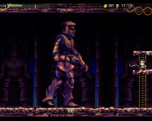
The short attack range of your primary weapons makes it very difficult to fight the many enemies without getting hit yourself.

La-Mulana’s puzzles and clue system try too hard to be complex, and instead leave the player guessing as to what to do next.

It reminds me almost of older adventure games where once you find a new item, you then go back to every locked door or puzzle and use said item to see if it unlocks the next path.

Except here, you actually have to fight your way back to each spot first.

Speaking about fighting, La-Mulana‘s combat system leaves a lot to be desired. The problem was that while the player was stuck using conventional controls and movement, the enemies are not.

Your attack range was very limited: just barely the height of the character. When you combine limited range with committed movements it leads to frustration. Most of the time, you’re going to run into the enemy taking damage when trying to hit them. This occurs even more when you have to jump at enemies to hit them.

In the end, La-Mulana comes close to being an amazing game, but skids right off the edge into a frustrating and poorly designed experience. Creating a game that challenges without frustrating the player is an art form, that many try but few succeed.

  • Grandy Peace

    I would love to love this game, but I can’t. Movement in a game like this is too important. I don’t necessarily need to be able to bound around (at first; it’s a genre staple to aquire “movement boosters” as you go, and while I don’t consider that mandatory it is nice). But I should be able to jump onto, and off of, ladders. And yes change my positioning more once in mid air.

    I’m sure some of the puzzles I have encountered are solveable once I find the correct runic tablet somewhere. But where on earth might those things be? Anywhere, and exploration of the dungeon/tomb/whatever proper is pretty dangerous. There’s already an element of tedium early on. Also, I have aquired two maps and can’t figure out how to use them.

    It’s too bad, because the game has immense potential. I love a good metroidvania. But I can tell that some of this stuff will get annoying sooner rather than later, and the movement is already a drag.

    • Regarding the maps that threw me off too. Apparently it tells you in the manual but not in game that to access the map it’s the F1 key

      • Grandy Peace

        But that doesn’t give me a map – just a name. Or is that all the mapping I get? “Surface”, “Heavenly Gate” (or whatever the first area is called), etc?

        • There is a computer program that you can buy in the town that works with the maps that you find and displays them from the F1 screen.

          • Grandy Peace

            Oh, I’ll have to get that. I purchased the pistol but I’m almost out unfortunate (shot twice by accident, killed both red skeletons but I’m sure they respawned). On the upside I’ve accumulated a decent pile of gold again. I also didn’t realize at first how much you can use the scanners on. I’ve seen 2 or 3 blue eyeball rooms and I’m already annoyed by them. The game seems to require that I experiemnt with the environment, and they punish this to an extent.

          • Just wait, they get far more annoying in the later sections.

          • Grandy Peace

            Well they didn’t respawn, so that’s something. I completely missed the software store the first time in town, so I’ve got both programs now. I also managed to solve a puzzle and get the shuriken. I saw where shuriken ammo can dropm so that’s encouraging. I guess. Such a promising game, but it’s already getting annoying having to trapse back to town to save. It lacks the organic exploration of SotN and Metroid even early on. And it’ll obviously get more annoying as I go.

          • A quick FYI, you’ll find additional save points in each section and there is an item that you can find that provides warping to and from each save point.

  • Erolunai

    It sounds more along the lines of only unearthing your own personal frustrations with being unable to cope with the game’s mechanics, rather than a fair criticism, to be honest.

    Ever since the first game you’ve played, it has never up to the game to understand you, to make it apparent for you what you need to do, where you need to go, it provides a set of rules, and you manipulate them in order to progress, to achieve something.

    You’re never meant to start off good at a game right away, you get better, you learn, you adapt. If you don’t, you won’t be able to progress.

    enemies respawn, you have to explore in a non-linear fashion, you have to think about the each element of the world and not just tackle everything head-on, would the game be better if you’re left with barren, lifeless rooms after your first time through them? If the game held your hand and took you from A to B for each puzzle?

    You learn to judge distances, to work on timing, enemies that used to smack you in the face, you’ll be cracking in theirs. The better you get at this, the more fluid your motions will become, the easier exploring will be, and the less frustrating the game will be.

    • Unfortunately when your first remark is to question the person instead of trying to refute the points made, it doesn’t help your argument.

      There is a big difference between letting the player explore wherever they want and actually letting them progress. While the game was open, it became more restraining as you realize that certain puzzles required items or knowledge no where near the actual puzzle. It’s an example of poor design because the game was difficult for the sake of being difficult instead of challenging the player.

      You can tell me that every puzzle made perfect sense to you the first time you played it and that you beat the game without looking at a guide, and I’ll call you a liar just the same. La Mulana was designed in similar fashion to old school adventure games where puzzle solving was not based on player skill, but guessing at the solution or finding an esoteric clue. You can call that “being open-ended” but its not a challenge to randomly hide clues all over the place, it’s just frustrating.

      Going back to old game design where designers placed death traps or puzzle solutions that the player would never know about until they failed it. Yes it was “difficult” but they were not challenging the player to play better.

      • Erolunai

        How so? A game is a personal experience, you put it in the title, “Unearthing -Frustration-“, frustration is a matter of the person playing the game, and all your points revolve around it. How do you expect someone to refute your points without touching on that they’re your own personal frustrations and do not apply to everyone who may play this game?

        The game may be open, but it’s not that difficult to find your way around, and I liked that the required items or knowledge were sometimes in out of place locations, and I do -not- consider it poor design. The puzzles did NOT make sense the first time, but every puzzle had a logical solution. Traps were traps, and you watch your step.

        I just don’t get how you can constructively say “Oooh, a really, really suspicious treasure chest/pedestal/room, oh no! spikes! Now I’m dead because I didn’t take any caution. BAD DESIGN.”

        It was not designed in the sense of “try everything and hope something works!” – If that’s how you chose to play through it, that’s probably why you didn’t like it.

        The “old game design new game design” argument is just silly. It’s a game, you learn the rules, you don’t judge the game rules by rules of other games. The game is challenging in a good way, it just doesn’t sound like you were up to that challenge, got upset half way through, and decided to rant about it.

        Which is fine, I would be with you if you said “Oh, I just didn’t like it, these are the points why.”, but you make it out as though it’s the game’s fault for your own difficulty getting into the game.

        Games need criticism, La Mulana is no exception, but this does not feel like criticism. It’s frustration, and that’s all I’m seeing from you.

        • You have yet to actually defend the game mechanics and instead are stuck on the title of this post. So far the examples you have given are not about the game, but about trying to defend outdated mechanics. Can you give me specific examples of puzzles you liked and thought were excellently designed?

          I would like you to point out in my post where I said I declared the game was bad because I stepped into a spike trap.

          Saying that you liked having clues to puzzles hidden in areas that are in no relation to the puzzle itself, is the same thing that many old school adventure game fans criticized the genre from moving away from. It’s not good design, but simply raising the difficulty curve of the game without giving anything back to the player.

          You said that the game was about learning the rules, but what rules are you talking about? Movement and combat have to be learn in the first section. The rest aren’t rules but arbitrary conditions for solving puzzles.

          Case in point: how every holy room had a different failure state which the player would not have any idea about until they set it off.

          Once again a game like Dark Souls was better designed: the rules remain consistent from beginning to end and is all about testing the player’s mastery of the mechanics. Not about hiding miscellaneous mcguffins that are key to your survival.

          • Erolunai

            You’re not making too much sense yourself, nor have you specified any particular puzzles yourself.

            You claim they’re outdated, you claim it’s bad design, but you’ve yet to prove your points other than say “I failed at them and that’s why they’re bad.”

            “Every holy room had a different failure state”? No such thing. There are two conditions really.

            One, if you damage a holy artifact, you get punished.

            Two, if you use a weapon in a certain temple (Of which the entire thing is considered such an artifact, so hitting it from the outside counts too.) which isn’t a problem because you quickly learn not to, and you have no -need- to use a weapon there. why, going to break a few pots that don’t have anything in them? can’t dodge the two enemies that are in there?

            You see the telltale eye that says there’s something delicate in this room you should not touch, and then you realize you -shouldn’t- just bash your head into everything you find. It’s not that hard to figure out.

            Two failure states, one limited to a particular area, and you say every room has a different failure state?

            It seems pretty consistent to me.

            Likewise, with secret rooms, your laptop gets a map program, there are maps found in the different areas. looking at the map will show you -every single room-, so when you’re exploring, you can think “There must be a way to get there”, so yes, there are secret rooms, but not ones that you would have to be lucky to find.

            Again, I find it ridiculous that you claim these game mechanics as “outdated”, a meaningless claim that’s only given in spite.

          • Shunk

            I can name one specific puzzle very early on that is incredibly obtuse: getting the map in Mausoleum of the Giants. You have to go to one room and hit a switch, then go another room to use a pressure plate…said rooms are about 5 screens away from each other, and the first time you use that pressure plate it ends up being a trap.You then have to go back down to the original room to get the map. Now tell me how that is a puzzle with good design? That entire mausoleum is pretty obtuse, but you can figure it out if you read the plates. One statue falls over, one kneels, and one hands something depending on what is at the top of the dais in the lowest room…but good luck finding out which does what and in what room each event happens considering there’s no indicator of anything.

            The game is fun as far as combat goes so I disagree on that part, but the puzzles are so difficult that you kind of need a guide alt-tabbed in another screen if you hope to get anything done other than boss battles. Exploration is decent until you realize how bad some of the stuff is laid out. You need the helmet in order to do stuff in the Spring in the Sky…which you pick up, for some strange reason, in the Twins Labyrinth from a shop. That is not good design or clever puzzle-solving, that’s just plain difficult and bad level planning.

          • Erolunai

            Getting the map in Mausoleum of the Giants – you do not have to activate the trap the first time, and… I’m sorry, 5 screens apart? The map is one room above that pressure plate. To get back up there, you can go one screen right, one screen up, one screen left. There’s a line in the background going down from the treasure chest to the pressure plates.
            So yeah, switch not pushed = trap, switch pushed = not trap, very simple, but I don’t see how it’s bad design.

            “But you can figure it out if you read the plates”
            Exactly. If you read the plates. If you think. If you think hard enough, you can connect them and realize what it’s asking. If you don’t think, a tiny bit of trial and error will get you to where you need to go.

            Now that I’ve got my steam key, I’m going through a second run, so far I’ve yet to see any puzzle that you can’t find out with information you find in the game. You don’t -need- guide, it just helps if you get stuck and give up.

            The puzzles are difficult but rewarding if you tough ’em out and solve them yourself.

            Moreover, I have yet to realize how stuff is “laid out bad”, unless I imagine you’re the kind of person who thinks you need everything given to you in a straight path with no challenges whatsoever.
            Getting the helmet is not puzzle-solving, it’s simply obtaining an item that allows you to progress further.
            It may not be the best design, but that’s the spot they wanted you to get it, so you have to deal with it. It’s an insignificant design choice, and I seriously doubt the people who enjoy the game go into that shop and come out screaming “The helmet was HERE the whole time!? that’s BS!”

            To be honest, these all sound like trivial gripes. I don’t see anything wrong with the game, just things that some people don’t like.

            And that’s what this whole discussion has been about, the difference between saying something is just plain bad, and saying “I don’t like it.”
            When you toss around words like bad level planning, poor design, “difficult but not challenging difficult”, these should be used only after a lot of thought has been given, and an opinion as far away from being biased has been formed.
            If you’re not ready to do that, you’re going to start arguments, and that’s why you don’t say “oh, it’s the game’s quality that’s bad”, you say “I just didn’t like this aspect of the game.”

            If that was the case, I would not be here, I’d just shrug, take it as the respectable opinion from someone who doesn’t like the game, and move on.

            But no, you challenge the quality of the game, which many would find excellent.

            Personally, I -like- that it’s difficult, I -like- that you have to think, and connect reasoning and logic, and pay attention to what you’re doing instead of just mashing a few buttons to get from point A to point B.

          • Shunk

            If you see nothing wrong with the game you’re incredibly biased since there’s plenty wrong with it. That doesn’t stop it from being a good game, it’s just not well designed according to level layout.

            Here’s the thing: there are several instances where if you put down a weight then either a trap will activate or a puzzle will be solved. If you hit a trap, you’re conditioned to not make the same mistake twice. You run into the plate with the trap long before you ever get to the map room, so how are you supposed to know that it’s not a trap after a switch is flipped 3 screens away? You can’t because there IS no way of knowing unless you look it up first. Same thing with the statues and the disk. If you read around and look at the tablets, you get some idea that the times mean something in accordance with the area, but you don’t know which statue does what unless you look it up, and you also don’t know in what order you’re supposed to hit them. If you want to compare something, you can look at Super Metroid which does the exploration thing properly. You can go into water stages if you want, but without the Gravity Suit it’ll be difficult to get around. The puzzles need to be intuitive, with clues located in the vicinity of the puzzle itself and all elements within a contained environment. If you hit a switch in one room, it should activate something in the next room over that you should see. It shouldn’t activate something somewhere in the dungeon and then expect you to backtrack through the whole place just to find out what it did, if it even did anything significant. That’s how La-Mulana works. It sucked in Myst, it sucks in this game. Some puzzles are good and fun, others are just stupidly frustrating to the point that it would make most players give up on the game or look for outside help.

          • Erolunai

            There’s certainly not as much wrong as you’re trying to make it sound. And still, it -is- well designed, it has good level layout. I’m sorry, but you’re going to need a better example than a switch for something that’s in one room over, where you can SEE a connection to that room. No way of knowing? If you have -no- way of seeing a connection in a line going up and down, and need a guide to find that map, I’m sorry, but I don’t see how you can logically connect anything. Again, it’s only ONE screen away that requires three screens of travel.
            Ooooooh, three screens, that takes what, 15 seconds to get through?

            Honestly, I have yet to see any validation to your complaints, they sound like minor gripes made to sound like more than what they are, and show no example of poor level design other than “It’s bad because I say so.”

            Just telling me that I have bias and that’s why you’re allowed to say it’s poorly designed is backwards, since all I’m hearing is -you- can’t figure it out and that’s why it’s poorly designed.

          • Shunk

            I’m saying that the average gamer can’t figure it out unless they’re willing to spend hours on puzzles. Granted, the early parts of the game aren’t that difficult and everything is (somewhat) straightforward there, but it’s still a big problem going into areas with absolutely no sense of direction or even knowing if you’re allowed to be there at that point in the game. That might be part of the exploration aspect, but in other games the puzzles are usually clearer and you know what goes where and what solves something when exploring. Once again, look at how Nintendo does it. They tend to keep the puzzles located to one specific room or series of rooms that have obvious connections.La-Mulana doesn’t. You can activate something or explore something and have no idea how you’re supposed to progress for quite a while. Unlocking the secret shop in the Twin Labyrinth, even learning that you need to buy the Hand Scanner to save the game are all just minor things which add up over time to massive amounts of frustration. Back to the Mausoleum, the disk at the bottom does change things around and it does tell you what changes things. The problem is that it doesn’t tell you WHERE those changes occur, forcing you to backtrack and explore every room of the dungeon.

            They may seem like minor things to you, but not all complaints are created equal. A lot of people find them immensely frustrating, such as this reviewer. I find them to be a minor annoyance but nothing that won’t stop me from finishing the game. You’re making it sound like I’m saying “this game is terrible.” No, the game is very good. It’s just mind-numbingly frustrating at times and I can see why the average player might give up on it.

          • Erolunai

            I just started up a new game, jumped right over to the save spot, and saved, no hand scanner needed whatsoever.

            If you’re talking about the original La Mulana requiring you to buy something to save, then yes, that game is a lot harder and quite a bit is left unexplained, and it would appeal more to gamers desiring a challenge.

            And that stays the same here, it’s not an easy romp, and I like that there’s more challenge and thought needed here.

            I won’t lie, there have been times while playing, where I would retrack through areas and having no idea what to do or where to go next, and eventually, after a while, I found my way. At one point there was a puzzle with numbers that I just didn’t get, I had to look it up, as much as I wish I didn’t and found the solution through something shown in the game.

            To some extent I like that it doesn’t tell you where to go, so that I have the opportunity to find it out myself, but I can see where an average gamer who just wants to get on with things would dislike that, yes.

            But the thing is… all these things that are stated as “design flaws” (when they’re not just completely out there, like that comment of the “holy sections” having a different fail condition every time) are things that I ENJOY about the game.

            If one person thinks that it’s a design flaw, while another enjoys them as a part of the game, who’s right? Will you tell me that it’s by some -flaw- in the person that likes it?

            And that’s the thing, I can completely agree that this won’t appeal to everyone, I can completely agree that some people will find it less of a game. I was lucky in that everything “clicked” for me and I had a -very- enjoyable experience. If it was any different, any less difficult or mind-bending at times, or if it was more straightforward, I probably wouldn’t like it as much.

            I can also see how people -wouldn’t- like these things as well, and it’s FINE to not like them.

            The thing is, there are a lot of games I dislike as well, I may find flaws to them, but flaws will be different depending on the perspective of different players.

            Those that designed the game can’t design it for absolutely -everyone- to enjoy, it’s an impossibility.

            There are certainly flaws that may be agreed upon by a wider range of an audience, some that are more subtle, some that are blatant.

            I’m sorry that I make it sound like you’re saying the game is terrible, but this whole scenario is pushing my buttons entirely.

            This is a website called “Game Wisdom”, and yet this article is simply unfair. It does not discuss how these flaws could range from person to person, it’s simply “I didn’t get it, therefore it is bad for -everybody-.” and more than that, to state it so extreme as to call them design flaws.
            A design flaw should be attributed to something more serious. A design flaw is something that seriously affects the game, that is counter intuitive. Inverting left/right movement would be a design flaw. Providing a weapon that runs on ammo and no ability to gain ammo for that weapon at all is a design flaw.

            A puzzle being a little harder, or a little more obtuse is not a design flaw. A path being a little less apparent, a little less straightforward is not bad level design.
            At most, it may be more inconvenient to some/many, a better choice could have been made. For your example earlier, there could have been a ladder much closer, only one screen travel needed, and it would have felt much less obtuse. This is something they did with the holy grail, as soon as you get the helmet for example, you can consider it a “key” that unlocks the path forward in the springs, and you can use the grail to warp -immediately- there. The manual tells you what the helmet does after all.

            However, I understand what you meant by the gravity suit, you get it right around the area you need it in, and don’t need to be told what it does. I think that’s better.

            This article, however, reeks of pretentiousness and insults with little more than opinions and no substance to back it up. I enjoyed talking with you far more than reading the article, and I apologize if I got a bit overly defensive.

            So I can agree with you, it is mind-numbingly frustrating at times *cough-ConfusionGate-cough*, and I can definately see why the average player might give up.
            I can see why people would dislike playing this game.
            I just disagree with ridiclously pretentious articles saying that a game is crap for -everyone- because the author doesn’t like it,.

  • Kuraudo Unplugged

    This is one of those times where someone links me a review about a game I love, I go to read it, and then I become overwhelmed by how somebody can take such a drastically different opinion from my own.

    I don’t understand how you can pan La Mulana and then turn around and urge people to try a game like A Valley Without Wind 1/2.

    Opinions, wow.