I recently had a chat with Steven Spohn of Ablegamers that will be going up soon on my channel and site. In it, we talked about what accessibility means not only for game designers but for the consumers who are playing games. Discussing the misconceptions and myths about accessibility made me think again about approachability and accessibility, and I wanted to take a chance to revise my thoughts on the topic.
The Difficulty of Defining Accessibility
Accessibility means different things for different people, and why there is a problem both among consumers and developers in terms of defining it. One of the topics that Steve and I talked about was that there is no such thing as a checklist for accessibility: that if a game has A, B, and C, it’s automatically accessible to everyone.
There are certain elements that are universal, such as control rebindings, volume sliders, and text size that can fit any videogame. However, accessibility needs to be approached differently for each genre and each gameplay loop; what works in one doesn’t necessarily work in another. For a game to be accessible, it’s important to look at what are the major pain points and walls that are stopping someone from experiencing a game.
Case in point, the often debated talk about From Software’s titles. Many people argue that any game without difficulty sliders is inherently not accessible, but From Software’s latest titles do feature accessibility options to them in terms of subtitles, control rebinding and more. Some will say that if the game just has an easy, medium, and hard mode then the game would be fair for everyone, right? Not necessarily, and this is a trap a lot of developers and consumers fall into with difficulty and the point of this post.
To understand why something is difficult, you need to be able to comprehend what are the stumbling blocks for someone: Is it a matter of timing, execution, speed, limitations of the gameplay, and so on. Let’s imagine that From Software patches an “easy mode” into every Dark Souls game released, and the only thing it does is reduce enemy damage by 50% and nothing else. If someone doesn’t have the hand-eye coordination or muscle control to properly time attacks and dodge, 50% damage reduction is not going to help them win fights, especially against the later bosses.
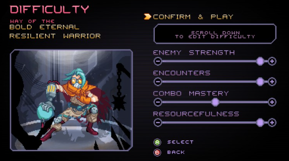
A better example, and what we’re going to talk about in the next section, comes from Way of the Passive Fist that I mentioned in the last post about accessibility. The game features multiple tweaks to the combat system: affecting parrying time, number of enemies, number of checkpoints, and more; all of which can be toggled to different points. The Last of Us 2 also allowed someone to personally tweak different aspects of the core gameplay loop depending on the person’s abilities. If they were bad at stealth, but good in combat, they could adjust the systems accordingly. Imagine if the Dark Souls series had options to slow down enemies or increase the window on parrying and dodging.
Here’s where things get confusing, the examples I just mentioned are technically considered accessibility features but aren’t really considered that way by a lot of people.
Approachability AND Accessibility
One of the stories Steven told me about on our cast was when he gave an award to a game for being accessible, the developer didn’t really think that they did anything accessible with it.
Here’s the simple truth that every designer and member of the game industry needs to understand: GOOD GAME DESIGN IS ACCESSIBLE GAME DESIGN. The problem is that many people consider UI/UX design as just UI/UX design and nothing more. This was the point of my last piece that tried to break down the differences between approachability and accessibility. The dirty little secret is that both are examples of accessibility in games, but they approach it (no pun intended) from different sides.
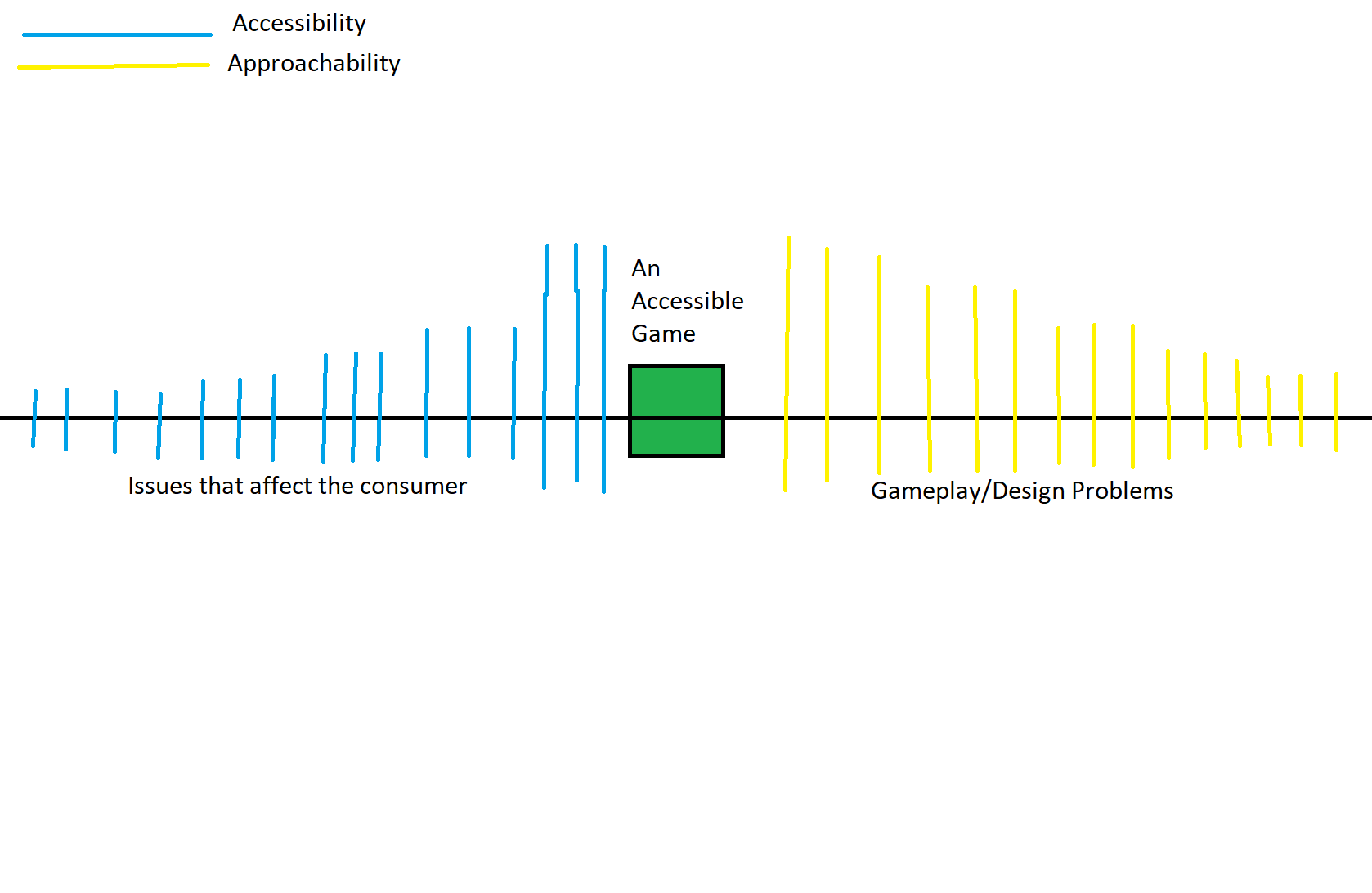
I’ve made a simple chart to explain what I mean and please excuse the poor attempt at trying to make it symmetrical.
Looking at the chart, you can see how both accessibility and approachability issues affect different problems that are stopping someone from playing a game. Accessibility issues start more focused on specific conditions, colorblind mode, support for specific hardware, and then they become more general: Font size changes, volume sliders, etc. Accessibility solutions are meant to be toggles or elements “layered” onto the core gameplay and design of a title to make it accessible but do not change how the game is played.
Approachability, or UI/UX design, is about making changes to the gameplay and design of a title to allow more people to be able to play through it. “Simple” examples would be making the UI easier to understand, while more complicated ones would be redesigning systems or the game itself to make it more streamlined.
As we approach the middle, these would be examples of elements that benefit larger groups and may influence both as accessible and approachable elements. There is one other factor about this graph that is important, for a game to be considered accessible, both accessibility and approachability elements must be set up, not one or another. It doesn’t matter how accommodating you are in terms of making your game accessible if the game mechanics are confusing and the UI is poor. Likewise, a well-crafted game can still lack for people who suffer from disabilities in terms of allowing them to play.

Both approachability and accessibility are about figuring out what elements can be made easier for people to play
And this takes us back to the start of this post, and how there is no one size fits all approach for making a game accessible. You’re not going to find a game engine that gives you the toggle “Make Good Tutorial Y/N.” Returning to the topic of difficulty, if your game just features generic (or blanket) difficulty sliders, then that would be an example of an accessibility feature. But if your game allows for complete customization of the different gameplay loops, that would be an example of approachability.
Start Early:
Lastly, I want to touch on something important for developers. When we talk about accessibility or approachability in a videogame, it is always better to start thinking about this as early as you can. From an accessibility standpoint, this is where places like Ablegamers, accessibility SIGS, and people who focus on the topic can help you understand what you need to know. One of the other myths Steve talked about is that accessibility options are expensive, and they are not expensive to implement, especially if you start your game’s development with the mindset of including them.
Approachability is something I feel is a bit harder to understand. One of my major growths in terms of analyzing design is being able to spot UI/UX issues in games. It’s one of those things that you don’t know about it until you start looking into it, and once you do, you can’t turn that part of your brain off. And again: playtest, playtest, playtest, your game. If you want to see if something is stopping people from enjoying the game, the best way to do that is to put it in the hands of said people. The final point is that accessibility is not meant to “cheat” while playing a videogame or lower the achievement of winning, but simply allowing more people to be able to experience games — and that is a goal that every designer should be thinking about.
Be sure to listen to my interview with Steve when it goes up on Game-Wisdom and on my YouTube.
If you enjoyed my post, consider joining the Game-Wisdom discord channel open to everyone.


