Video games are obviously visually focused and companies spend millions of dollars making the best looking games possible. It’s why engines like Unreal and Crytek are sought after by developers with the budget to have them in their titles.
But there is another side of making a game that looks good and that’s getting the aesthetics right and is something that Indie developers and Nintendo continue to do.
Being Artsy:
Graphics and aesthetics may sound like the same concepts, but their differences are important to talk about. Graphics refer to the level of detail and quality that are in a game and can be seen in graphically intensive titles like Farcry 4, Call of Duty and of course Crysis.
In these games, the power and quality of their graphics are amazing and are designed to deliver almost photorealistic levels of graphics to ooh and ah over. For AAA titles, this can be a major part of where the budget goes into as licensing and developing assets at this level of quality cost a lot. Most indie developers and even AA will never be able to put out graphically intensive titles the same way as an AAA developer and is one of the main attractions of the AAA market.
However there is a downside to focusing on graphics like this. There is only so far you can go with graphical fidelity and it’s arguable that we are reaching that limit with this generation not looking as different compared to the best of the last generation. As I mentioned with pricing, it is always an increasing cost to use more powerful engines much like how it is to keep buying new parts for your computer.
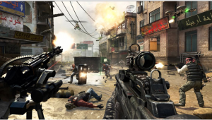
Games built around graphical power tend to look really detailed but lack any real unifying style to make them stand out from other games.
And from an art standpoint, quite frankly it’s boring to look at games that make use of the same graphics style. It’s why all the new Call of Duty games tend to blend together much like Battlefield and other AAA titles.
For those reasons, this is why games that focus on aesthetics tend to fare better over time.
Giving Style:
Aesthetics for this post will be defined by having a unified style to your game that gives it a unique look. This look can be achieved a variety of ways and we can see this in some examples: Mario Galaxy, Dungeon of the Endless, Child of Light and so much more.
These titles don’t have the most powerful graphics engines attached to them but make up for it by having a unique aesthetic that defines the game. This is also why great pixel art is in such high demand as there is a huge difference between games that use it purely for budget reasons and those that transform it into an art style. You can see this in titles like Dungeon of the Endless or Gods Will be Watching who both make use of high quality pixel art.

High quality pixel art may not be demanding on hardware but can still look amazing and give a game an unique style.
It’s all about having an art style that brings everything together with another example being The Binding of Isaac. Everything in the game stands together as a part of the aesthetic and any screenshot that you see will instantly tell you that it’s from Isaac.
The advantages of focusing on aesthetics over graphics is that in the long run it’s cheaper to make a game like this as opposed to having to use the most expensive engines on the market. A great visual aesthetic can help a game stand out and make them less likely to appear dated. If you look at the early 3D games where the technology wasn’t really that far along, everything had a muddy, polygon-like appearance that didn’t look all that interesting. Yet strong 2D art was still in demand like in Castlevania Symphony of the Night.
The main problem with going this route is that while it is cheaper, it is a lot harder and possibly time consuming on your artists to create a unique visual style. Games like Child of Light or Bioshock Infinite didn’t just create their aesthetics quickly; it took a lot of time and experimentation to get it just right.
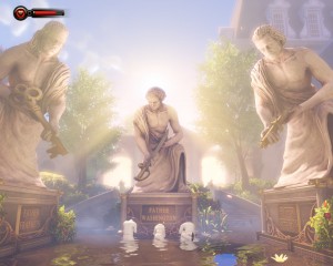
Bioshock Infinite is a rare example of an AAA game that went with an aesthetics focused and it paid off for making it stand out.
But for developers who can create great aesthetics, it can help them make a game that stands out compared to those that just focused on graphics and as I said at the start where Nintendo has a strong advantage.
Visually Stunning:
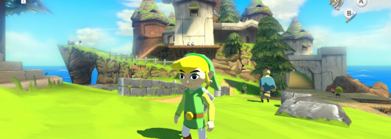
My “smoking gun” example of why Nintendo’s aesthetic design is so great comes from The Legend of Zelda Windwaker HD for the Wii-U. The original Windwaker already stood out thanks to its cel shaded design, but the added oomph from the HD is just amazing.
This is the perfect example of a game with a strong unified aesthetic that stands out and sticks with you. And the same goes for a lot of Nintendo’s games — Mario Galaxy, Paper Mario, Smash Bros etc. The beauty of this is Nintendo doesn’t have to spend anywhere near the same amount of money on asset development like Sony or Microsoft has to with their more graphically intensive engines. But they still get their money’s worth by creating very aesthetically pleasing games that you can’t see anywhere else. Upcoming examples would be titles like the next Kirby game, Yoshi and their new game Splatoon.
Now of course Nintendo can’t do photo realism due to technical constraints, but considering the talent of their artists why would they need to? Strong visual aesthetics are an effective branding and it’s all about getting value out of every part of a title that you can. So that when someone sees a screenshot of your game, they immediately know what game it’s from.
Substantial Style:
Aesthetic focused art styles may be more work than focusing purely on graphics, but they provide a way for developers to stand with AAA developers who focus on pure graphics power. This is where having talented artists on your team can pay off and why they will never go out of style even as game engines continue to grow more powerful.

