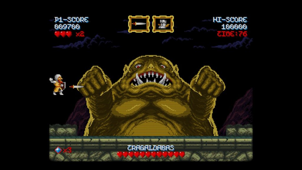
The indie space is home to a number of franchises and genres, and one of the biggest trends out of the space in the past decade is the “modern retro” craze. From Shovel Knight to Celeste, Owlboy, more RPGs than I can count, space sims, boomer shooters and the list goes infinitely on. There is something great about making a game as an homage to a title that you love, but as this trend now continues into early 3D, I feel we need to have a talk about where modern retro doesn’t work no matter how hard designers try.
What Does Modern Retro Mean?
Modern retro is the goal of making a game to look and feel like a title from a previous generation(s) of game consoles or PC hardware. If you were playing indie games for most of the first half of 2010, you were playing the many 2D platformers released that used pixel art as their art style. Some of my favorite indie games have been those that have managed to elevate these retro games in a different direction — Shovel Knight, Alwa’s Awakening, and Odallus to name a few.
These games look and sound like they were right at home on the NES hardware, but still did things different or unique; keep that in the back of your mind, as I’m going to be coming back to this point further down. Retro games provide a well-tested and marketable template for designers to work in, and why I made my first major design book about platformers.
Many modern retro games are built to resonate with fans of the original games, or as the designer’s way of wanting to honor a game they loved growing up. However, just because you’re working with an older design doesn’t make things instantly easier.
Pain or Pleasure Points?
I’m about to type something that is going to sound very off after the last section– retro games aren’t that good. For every game that we remember fondly like Mario, the original Resident Evil and so on, there are countless games that not only don’t hold up now but weren’t really that good back in the day. X-Com UFO Defense may be one of the best games ever made, but it is a terrible game to go back today and play if you didn’t grow up with it.
There are several reasons why a lot of classic games just don’t hold up all that much. This was before the thoughts of UI/UX design were considered important outside of studios like Nintendo. Many games were oftentimes the first of their respective genres and design, so it was very much figuring out things as they went. And of course the technical limitations of the hardware that developers had to work around.
Many gamers have held on to this myth that retro games were from a bygone era where “games were perfect and didn’t ship with any bugs.” As we learned from speed runners, these games had a lot of bugs and oftentimes pushed the hardware to its limit. The point is that there is a difference between looking at a decision or design point in a retro game as a commandment that must be followed or a trick to get around the limitations of the hardware.

Developers like Locomalito work on modern retro design, but do what they can to modernize the design
There is another tendency to create modern retro games around said limitations and pain points, but putting something into a game for a modern audience that was frustrating back then is not the way to win over fans. Games like Shovel Knight still provided modern UI/UX design to make the experience approachable.
Despite their age, creating a great modern retro game is very difficult to do and many developers end up missing the mark.
Reinventing the Wheel Worse
Another problem that a lot of modern retro designers fall into is ending up making their version of a modern retro game worse than the ones that were originally released. A classic example is the degrees of quality between pixel art games. There is a huge line between good and bad pixel art, and many developers treat it as simply an aesthetic and do nothing else with it.
One of the biggest pet peeves for me are games that have forced CRT filters on to emulate the “retro “feel, but end up making the games look blurry and poor in my opinion. I just want to leave this here: CLASSIC GAMES WERE NOT BLURRY TO PLAY ON CRT TVs. Playing titles like The Last Door and Blasphemous, both came from the same developer, both used pixel art, and both looked great while also looking nothing alike.
Returning to platformers, I’ve lost count of the number of platformers I’ve played that handle worst compared to games I played 30+ years ago, and I should know because I played a ton of them again when I did the research for my book. Again, putting in intentional pain points or frustrating design because “it worked back then” is not an excuse and not how you’re going to court new fans. There is a difference between featuring something in a game because it was a core component of the game design and just having something that was a technical limitation.

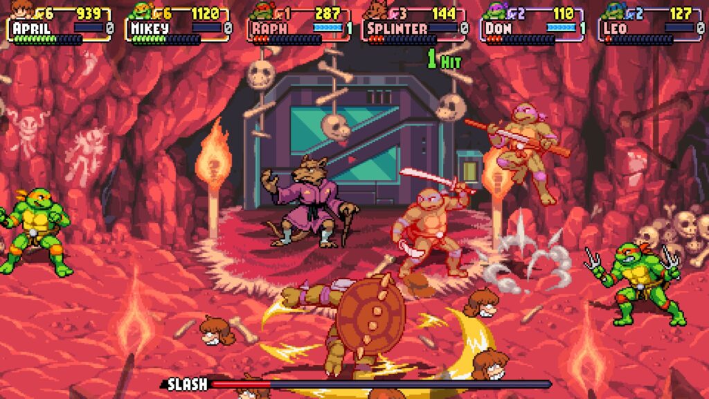
Recent beat-em-ups show that there is still life in the genre and room to grow
The recent successes of Streets of Rage 4 and TMNT Shredder’s Revenge both highlight making a retro-minded game, but also having the foresight to modernize the design. To be fair, sometimes this can end up with a game that is worst than the original and strips the game of what made it work: such as the Resident Evil 3 remake, but that’s also why you need to have a good understanding of the positives and negatives of the game you’re working with.
You don’t want to stray so far away that your game doesn’t resemble the original, but there is a problem with adhering too much to the original.
The Copycats
There are many modern retro games whose only goal was to be just like the game they remembered. There’s nothing wrong with setting up a personal goal to recreate one of your favorite games, but that is not the same as developing and releasing a product you intend to sell. If you want to elevate a modern retro title, you need to go beyond the original design and that takes me to this very salient point for the post:
A classic game is not the goal, it’s the canvas to create something new
Far too many developers look at a classic game as simply something to copy and then release as their own, and oftentimes end up making either a worse version or one that doesn’t compete in today’s market. I can say the same thing about how many developers try to copy the “it” genre or game and just don’t end up making something worth playing.
Just because game X did something good or bad doesn’t mean you should stop at just recreating that experience. Look at the Kaizo community centered around Mario. These creators have been taking Super Mario World into unique and different places far beyond what Nintendo could even imagine, with the best hacks being some of the most creative 2D platforming I’ve ever seen.
Going back to horror, the recent push into early PS1/PS2 graphics that I’m seeing now has a lot of the traps that I’ve talked about in this piece. Some feature a low FPS that the game becomes jerky to play, or the camera is constantly moving and making it easy to get nauseous while playing it. Again, you shouldn’t be designing a game with all the problems of early 3D and calling it a day, you should be striving for something better. To put this another way, for many retro consoles, there was a noticeably big difference between the first games on the platform and the last. As developers became acclimated to the platform, it allowed them to push it further with more refined titles.
For the developer reading this, look at new ways of expressing the genre or think about how games could have gone further if the platform lasted longer. The Messenger was one of the best 2D platformers released in the last decade and it managed to do that by combining 8 and 16-bit games into a style all its own.
I’ve interviewed the developer behind Nox Archaist, where the game was designed to be a brand new game off of the Apple 2 platform. When I interviewed him, he said that he wanted to create a game for fans of the platform, but he also wanted to make sure his daughters who never touched it could still enjoy the game. That meant looking at the platform and thinking about where else could games go if it survived longer.
A game like Stardew Valley was clearly inspired by Harvest Moon and its spinoffs, but the developer didn’t just want to stop there and call it a day, they added in more systems, more content, and made a version that was uniquely theirs… that people then tried to chase and copy.
Reinventing Retro
“Retro” is not a shield to criticism or complaints about a game’s design. Remember that the market is constantly changing, and you can’t use the excuse of dating a game’s design if you intend to sell it in today’s market. Even if you’re working on a game meant to look like something 20+ years ago, that doesn’t mean you should ignore UI/UX conventions today, and that includes accessibility features. There’s a reason why there are retro games that are still held as standards or benchmarks today, because they were willing to push things further than most, and ended up with a unique game.
Just like the other game genres, there is a wide line in terms of quality and for every game like Shovel Knight or Celeste that blows up, there are many others that you will never see people talk about. Don’t go into making a modern retro game thinking that it’s going to be easy or the work has already been done for you. No one wants to play 20 different takes on Mario, or 20 different worse takes on it. Even though something was huge 20 years ago does not mean it has the same impact today, even if there is a hardcore following for it.
Good game design is finding ways of putting a new spin on a classic, even if that means coming up with something that one-ups the original.
- Can you think of modern retro games that exceeded the games they were based on? Let me know on Twitter
- If you enjoyed this story, consider joining the Game-Wisdom Discord channel. It’s open to everyone.

