The game industry has grown tremendously over the 2010’s with the rise of indie development and games that didn’t have to adhere to the norms and trends of the AAA space. This has given us variety that has never been seen before in this space. With that said, when developers do think outside the box, it has also led to this discussion on “intentional friction” and whether it’s okay to frustrate the player in the name of art or telling a specific story.
What is Intentional Friction?
If you’ve read any of my posts, books, or watch my videos, then you know that I’m a proponent of good game design and UI/UX. The act of creating the design of a title for many people seems like a magic trick, but there is science involved. While it’s not something easily understood by a lot of people, consumers know when they’re playing a well-designed title, just as they know when they’re not. The idea behind intentional friction is to create an experience with explicit elements that aren’t the best, or optimized, for gameplay but add to the overall fiction and setting of the space.
We can see this in games like Disco Elysium, where you can literally die within 2 minutes of starting the game when trying to reach a tie. Every game developed by Tale of Tales would easily fit here. Then there is Getting Over it and Papers Please that both became famous for having esoteric control schemes and trying to elicit a very specific response from the player. In a way, intentional friction is a call back to my post about “jank” in videogames. Whenever we talk about the idea of “interactive art” games like these very much fit that category.
However, when people have issues that frustrate them, or outright cause them to stop playing, defenders of these games — sometimes including the devs themselves — will often justify these problems as “part of the experience.” That it’s not the game’s fault for being this way, it’s the consumer’s for not “getting the vision,” and this is where this topic can become polarizing depending on your views of game design.
Evaluating the Experience
Video games are many things to different people, but at the end of the day, every video game is a combination of a product and art. The millisecond you put a price tag on your game, you are creating a product that you intend to sell. That means you are held to quality standards that are expected by consumers when it comes to the games they play.
As we’ve talked about many times in the past with the misconceptions of game design, sometimes the game you want to make and the game you want to sell are two different products. People do not play video games to be frustrated, and there is a huge difference between “challenging gameplay” and “frustrating gameplay.” UI/UX are the ways people experience the game, not the game itself. A game with a frustrating or bad UX is not “artistic”, it’s a bad game. One of the problems that developers often have is being able to deduce the problem that someone is having. You can get three different responses about the quality of the game, and they could all be pointing to the same issue without knowing it.
If someone has a problem with your game from a UI/UX point of view, that’s not a problem for them, but a really big problem for you. Remember, for every person who is pointing out an issue with your game, there are countless others who are simply uninstalling and refunding it without saying a word. I see this a lot with indie devs who are more outspoken on Twitter with small or moderate successes. That if they keep talking about their game or getting 1,000 reviews, then complaints are simply from haters and that the game had no problems with it. And the devs who also agree with them are often the ones with games with similar problems.

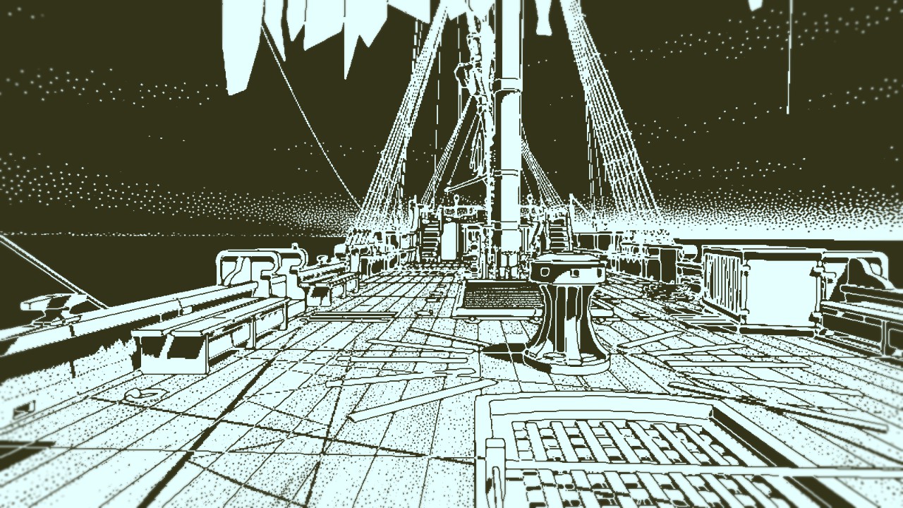
Return of the Obra Dinn is a game built around a very explicit gameplay loop that is part of the charm and challenge of the game
I cannot stress this next point enough: 1.0 of your game is not the time to start looking for player feedback and finding out problems about your game. This is why playtesting is so important, as I see developers who are often blindsided by very easy-to-spot issues with their game on day one and are left scrambling to fix them during their opening week. As I’ve said before, UI/UX issues are something that can plague a game from minute one of turning it on, and once you understand them, are easy to spot.
Getting the Point Across
When it comes to game design and gameplay, implementation is what separates good and bad designers. There is always a way of improving the approachability of your title while keeping to the vision you have in mind. As a designer, you need to know when to bend and when to hold with your ideas. If you try to put in every change, then you end up with a game without a clear vision of what it wants to be. But if you’re so rigid that you don’t listen to (or actively fight against) feedback, then you’re going to be left with a game with a very small consumer base that loves it, and the majority of people ignoring you in the future.
Not every game is meant to be universally loved, but that doesn’t mean you should be fighting against complaints people have about your design, regardless of your intent. There is a huge difference between making a game that is intended for a specific niche, like Dark Souls or Death Stranding, and ending up with a small fanbase due to people leaving the game in droves. Sometimes, all it takes is redesigning the tutorial of your game or basic UI changes that can radically change the UX of a game for the better. There are games that are designed around a very hardcore gameplay loop but have done things to make that loop more approachable. The fact that I could play Mudrunners for an hour and enjoyed it compared to frustratingly trying to play Spintires thanks to a better UX is proof of this point.

Good design is about being simple to learn and difficult to master, never the other way around
I’ve said this before: I don’t believe there are niche genres, but niche designs. Even with indie darlings, or AAA darlings, there is always room to examine a game and see if there is anywhere you can improve your design on in the future. Far too many developers don’t take that look at their games, and then just end up making the same designs and repeating the same mistakes over again.
Mainstreaming Niches
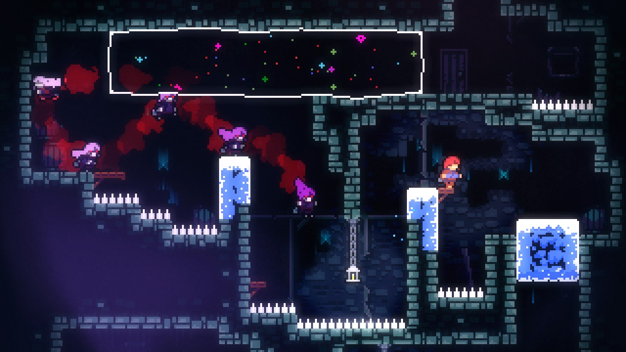
For many indie developers over the past decade, we have seen this “mainstreaming” of games thanks to the rise of YouTubers and streamers covering all manner of titles. Sometimes this leads to “hate-watching”, but other times this is how many smaller indie games blow up way beyond their circles. Be it Getting Over it, Celeste, and of course the recent huge example of Among Us.
The point is that as a developer, you should not be purposely or unknowingly leaving pain points and issues in your game thinking, “who’s going to know?” From a studio perspective, you do not want to give off the impression that you are releasing subpar games on the market, as that’s going to hurt you down the line. Version 1.0 of your game should be the very best version within your power to put out. The excuse that you’re a small indie doesn’t have weight anymore in today’s market.
It takes a lot to make a game a success, and very little for a game to fail. You should not give players a reason not to play your game. Everything needs to be on point: from the marketing to the store page, to the game itself, if you want a chance at success. The market is wide enough today that releasing a game, let alone a good game, is not reason enough for you to succeed.
What do you think about intentional friction? Are there games that you played that despite being interesting artistically speaking, caused you to stop playing due to the gameplay?
If you enjoyed this story, consider joining the Game-Wisdom discord channel. It’s open to everyone.

