As the Game Industry continues to improve graphics engines on the AAA front, we’re seeing developers strive for either realism or super detail designs similar to movies and other mediums. However, trying to reach that level of realism creates a problem that is similar to the uncanny valley effect and what I like to call loud visual design.
Hard to See:
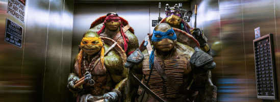
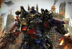
Loud visual design is where an artist tries to cram as much detail into a character or object as possible to the point where it becomes hard to look at. A perfect example of this recently would have to be the character designs in the Michael Bay Transformers and Teenage Mutant Ninja Turtles movies.
What the artist tried to do was take an unrealistic figure and tries to put it in a realistic world and they did this by overcompensating for how unrealistic the characters are.
With the transformers you see tons of armor segments, gears and all other kinds of doodads on their bodies. While the turtles have giant muscles, veins sticking out and look even more unrealistic.
The problem with loud design is that the character is so detailed that it becomes hard to focus on it and they tend to blend into the environment. When you’re watching two transformers fight in an urban setting, see if you can easily figure out what’s going on and what each one is doing.
A video game example would be the design of Isaac Clark’s suit from the Dead Space series.
Because the game is played from over the shoulder, the series avoids the complaints about the character blending into the background yet his armor was still overly designed.
When it comes to any kind of character design, form is key in making a recognizable character. Form generally refers to texture, shape and color of the figure. With video games, the issues of loud character design was something that we didn’t have to deal with in the early days and in the process, created some of the most memorable characters.
Quiet Design:
Quiet art design is where characters aren’t designed around being super detailed and instead are just detailed enough so that you have an idea of what they look like. Some great examples would be characters that have become memorable in the game industry: Mario, Link and Master Chief for instance.
With Mario and Link, neither character was designed to be super realistic. Instead they have a few unique qualifiers that allow you to recognize them — Mario’s red hat, Link’s green tunic and sword. Despite Nintendo improving their art design and detail in modern titles, the qualifiers remain the same. With the Smash Brothers series, Mario and Link did become more detailed, yet they still retain their quiet design.
Master Chief is different as the series has gotten more detailed with each iteration and in the process, so has Master Chief. But the form never changes and neither does the armor which is his qualifier.
With quiet designs, they stand out from the rest of the world and characters thanks to their unique qualifiers and in turn make it easier for you to process them. This is why so many classic characters are considered iconic and remembered as their designs were so simple that it was easy to be able to remember them and not just in video games.
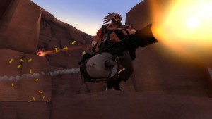
Soft design focuses on fewer details but unique qualifiers that allow you to distinguish the character or structure.
Both Bugs Bunny and Mickey Mouse are two of the most recognizable animated characters and part of the reason is that their designs are detailed enough that you know who they are, but not so detailed that the design becomes loud.
For a modern example you can look at the designs of the ponies from My Little Pony. Each character has a similar form and body structure, but the qualifiers are distinct and simple enough that the characters become both recognizable and stand out from the environment.
And as a counter example to Transformers mentioned above, if you watched the movie Pacific Rim which also featured giant robot combat. The robots were also designed with just enough detail to make them look like they exist, but weren’t so detailed that they blended into the background. I had a much easier time keeping track of the combat in Pacific Rim than I did in Transformers.
But the best example of quiet design from the Game Industry would be Team Fortress and why it has become a massive hit for Valve.
Red vs. Blue:
Team Fortress 2 originally was designed to be super realistic and going with the same style as other military shooters. But Valve decided to change it and went with a soft cel shaded animated style. And what happened was that the characters were not realistic at all, but had just enough detail that they become memorable.
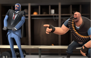
Team Fortress has become Valve’s strongest brand thanks to the world and design that makes the game stand out from everyone else.
You will never confuse the heavy with the scout or the demoman with the pyro as each character’s unique qualifiers are so distinct that the characters are easy to remember.
But none of them have realistic detail which has become their signature style. Valve has made a killing this way– releasing videos, comics, art etc.
But while Valve has learned the importance of quiet design, many developers feel pressured to go loud.
The Realistic Rush:
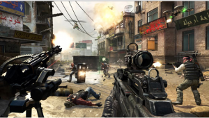
The issue is that as game technology has evolved more and more towards photo and hyper realism. Developers all want to push their engines to the point of creating super realistic looking environments and characters, see Call of Duty, Crysis and other FPS for example.
However as we’ve talked about over this post, loud design instead of standing out becomes derivative as everything tends to blend together. It’s why if you look at a lot of modern shooters who went the grim realism route, they all look alike.
Another example would be where a lot of Japanese RPG art design has gone, namely with the Final Fantasy series. The character designs continue to grow more outrageous and in the process unmemorable.
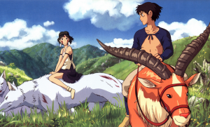
A strong quiet style that isn’t very detailed is better than something that tries to look realistic and detail.
A great example of that would be the works from Studio Ghibli. Character designs are detailed enough that you can make out facial animations and emotions, but lack any kind of deeper detail.
But that’s okay as the style and the detail that’s there is enough for you to process these characters.
KISS Principle:
One thing that I’m curious about is the news regarding the next Star Wars trilogy and how they are going to be designing or redesigning the various ships. The ships from the Star Wars universe have become very recognizable for their quiet designs, everyone knows what a TIE fighter and Star Destroyer looks like.
And what I’m wondering is if they’re going to try and make these designs loud in an attempt to make them realistic. Remember that age old adage: Sometimes less is more. Just because you can render every part of a character’s face and the environment doesn’t make your game look great.
If you look at Iron Man and Hulk’s design from the Avengers, neither character can be defined as realistic.
But there was enough detail present that you were able to easily distinguish them from the rest of the world while still being striking.
Many developers have created visually stunning games with minimal graphics thanks to a strong visual aesthetic. And in the end, those games are going to be remembered for a long time while the wave of FPS military shooters that bleed together are going to be forgotten as time goes on.

