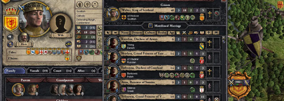
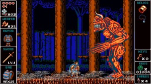
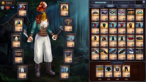
UI Design is an underrated part of game development and can make or break a game if not handled correctly. For many first time designers, especially indie developers, the UI is an area that is overlooked or just ignored. You cannot undervalue UI design, and we’re going to talk about why it’s such a mystery to a lot of developers.
What is UI Design?
User Interface or UI Design is about two areas of a game’s design. First there is the on-screen UI: Window panes, displays, health bars, inventories, and so on. Second, we have the actual control scheme for your gamepad or keyboard and mouse.
Right off the bat, both areas have their own unique goal when it comes to playing the game. For the on-screen UI, its job is to give the player all the information they need to be able to play the game. For the control scheme, it should allow the player to comfortably experience the game.
A bad UI is one of the fastest ways to push new players away. When I play a game for the first time, if the UI annoys me at any part in the first 30 minutes of play, most likely I’m going to give up playing.
UI Design is something that you should be thinking about from day one along with your core gameplay loop.
But no matter how vital the UI of your game is, there are several interesting reasons why it’s overlooked and hard to understand.
Art and Design:
First is a very simple fact: UI Design is the combination of Art and Design in your game. There is a huge difference between artists who can create amazing looking games vs. UI Designers. Being able to create a UI that is easy to understand and works with your game is an art form. Unfortunately, just having an artist on staff doesn’t do anything for UI. UI Design is about applying game design to art, and is a very specific skill.
Complexity vs. Streamlined:
Another knock against learning UI Design is that many people conflate a complex UI with a complex game. Over the years it has been an uphill battle to make complicated genres easier to learn. There are hardcore fans who see any attempt at making a game’s UI accessible as “dumbing it down.” I still remember a face palm moment I had reading the Starcraft 2 message boards of people complaining that Blizzard was going to list how many drones you should have at each resource point.
Here’s the first major point that you need to understand about UI Design: A Good UI is Never Complicated. Regardless of the genre, it takes a lot of work to make a straightforward UI. I always return to George Fan’s talk on Plants vs. Zombies and the challenge it was to make that UI accessible. Everything from where information is displayed, the font you use, what kind of info panels and so on must be taken into account.
If people are describing your UI as complicated, that is not a compliment. What makes things worse is that fans are willing to look past bad or hard to understand UIs, but don’t always see that as a hurdle for a new player. This is also why playtesting is so important for improving your UI. While someone with hundreds of hours played will know how your design works, someone with less than one will be able to tell you why they’re not figuring things out.
I have played more than my fair share of games that had a great gameplay loop, but be almost impossible to break into due to a less than adequate UI.
What is Your UI?
Video games in terms of design have been standardized over the years. In return, it has become easier to start designing a game of a certain genre by looking at the common elements: UI, Camera, gameplay loop, etc.
From there, a good designer should be able to iterate and put their own unique spin on the game. When it comes to UI design however, there is no standardized list of elements for a genre.
Every video game regardless of its design has different information that it must convey. Just because one game shows X doesn’t mean that every game needs to.
Going back to the first point, you need to have a really good sense of design to think about how your UI is going to look and function in your game. You should always be asking yourself, “What information should the player be aware of?”
Many Little Things:
For the last point today I want to talk about the other major lesson to know about good UI design. A great UI doesn’t just magically appear; it requires a lot of little tweaks and changes for everything to come together.
As I said, playtesting is a major part of designing a UI. You need to understand what parts people are getting stuck trying to learn. Just like how you should be refining your gameplay loop as early as possible, you should be thinking about your UI as well.
UI design is not something to be saved for the 11th hour, nor should it require work after release. In fact, if you are still making grand UI changes post launch, then something went wrong.
Death by a Thousand UI Issues:
UI Design is not something you should be overlooking as a designer. In a market where dozens of games are coming out daily, you don’t have the luxury of being the only game out there anymore.
No matter how great a game is, a bad UI is one of the quickest ways to turn off new players. Even with all that we’ve talked about today, there is still so much more to get into about UI design; such as control schemes.
To end this post: Can you think of examples of really good UIs that helped you learn an otherwise complicated game? And are there examples of bad UIs that turned you off of an otherwise great game?


