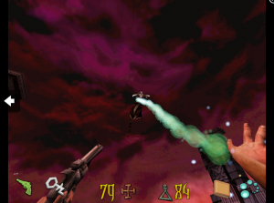
Last week in my analysis of Kid Icarus: Uprising I talked about how the controls of the game came close to outright ruining it. Over the weekend I spent more time analyzing and came to an understanding as to why the control scheme was so poor and a simple mistake that designers can make.
In an effort to make games easier to play, it is possible to make them harder to the point of unplayable.
Primary vs. Secondary Actions:
In any game built around the real time operating of a character or situation, the design of the game requires the player to perform multiple actions quickly. For this post we’re going to distinguish them as primary and secondary actions and define them as follow:
Primary Actions: Commands that the player will use constantly during play.
Secondary Actions: Commands that are situational and usually perform a special function.
Generally speaking, primary actions correspond to the basic verbs we can use in describing playing a game: moving, shooting, jumping and so on. Secondary actions are more specific and happen at select times, usually before or after performing a primary action: dodging, activating a special power, going stealth, double jumping and so on.
Ignoring turned based titles for this post, one of the challenges of a game designer is figuring out the best way to represent all these actions on an input device (controller, keyboard and mouse, 3DS, etc.) The common problem is that the more controls you have for the player, the more complex playing the game can become.
Case in point: Rainbow Six for the Sega Dreamcast attempted to translate every control option that fit on a keyboard and mouse to a 7 button controller. You can just imagine the nightmare that was trying to figure out how that game worked.
As control schemes have become standardized under the PS3/360 style of an 8 button limit for traditional console games, designers have done what they can under the constraint. One of those ways was combining secondary and primary actions to the same input, or in other words: creating context sensitive actions.
For instance: Tying dodging to the attack button, the use command to the inventory screen and so on.
On the plus side, context sensitive actions allowed the designer to create more actions without needing more buttons. However, as we’re going to talk about next, sometimes simplicity leads to complexity.
Controlling Conundrum:
Understandably the less buttons or inputs required to play a game usually makes the game easier to play. And in today’s world of trying to be as accessible as possible, designers want as many people to play their games. But the more actions you tie to an input can have the opposite effect.
“If performing a secondary action is vital to playing the game, it’s better to take the added complexity of assigning it to a specific input as opposed to shoehorning it onto another.”
What ends up happening is that you’ll have cases where the primary action will happen when you wanted the secondary or vice versa. This can make a section infinitely harder based on game balance.
In Kid Icarus: Uprising, moving and dodging attacks are tied to pushing the circle pad. During the game’s flying sections, you need to quickly move the circle pad in one direction to perform the dodge.
But during my time playing the game I couldn’t perform this move consistently as the game kept taking my input as just moving in the other direction.
While on foot, when you’re trying to move around an enemy the dodge action can go off moving you out of the area that you were aiming for to get an attack off. Or during boss fights the dodge may go off too early leaving you standing still for when the bulk of the attack hits.
Because the majority of the projectiles in Kid Icarus: Uprising hone in on the player, not being able to dodge accurately is a serious determent to playing the game at the higher difficulty levels.
In one boss fight during an air section, every one of its attacks connected because the dodge move was the only way to avoid them and I couldn’t get the game to recognize it.
If performing a secondary action is vital to playing the game, it’s better to take the added complexity of assigning it to a specific input as opposed to shoehorning it onto another. As being able to perform the action successfully at a moment’s notice can make up for it.
One of the worse examples of this kind of simplicity in Kid Icarus: Uprising is the option to put on auto attack from the game’s menu. On paper it sounds like a win-win of not requiring the player to keep pressing the attack button. However this clashes with one of the enemy designs.

Not being able to reliably trigger the dodge move makes air combat in Kid Icarus harder then originally intended
In some sections there are enemies that cannot be killed and are triggered to attack when you use the shot attack. For these parts you have to use melee attacks on the rest of the enemies.
However if your cursor goes over these enemies as you are moving forward, or you press attack too early, you’ll shoot at the enemy and trigger the attack.
While having the limitations of a handheld can be a challenge, we can also see these types of issues on the PC where there are far more control options.
Bioshock and Awe:
Moving on, as PC ports to consoles and vice versa have become commonplace, this has lead to designers streamlining controls to fit on both platforms instead of designing schemes that are tailored to the specific platform. Once again this has helped with making accessible controls, but in the process can lead to dumb down or frustrating to play games.
My favorite example of this is Clive Barker’s Undying vs. Bioshock. The former was designed first for the PC while the latter was designed at the time for both console and PC audiences.
Both games feature a similar combat system of two weapon types. Undying had spells and weapons while Bioshock had guns and plasmids. But the key difference was how the player could use both types.
In Undying you could select different weapons and spells both from the inventory screen and through hotkeys during play. Also both types of weapons could be used at the same time during combat.
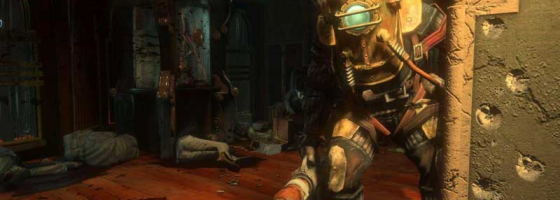
Bioshock while having the same basic combat went with what was supposedly a simpler system. You could only use one weapon type at a time or scroll through the respective choices. To actually use the other type or manage the available choices, you would have to press a button to switch between plasmid mode and gun mode.
In this case, Undying while having the more complicated control scheme was simpler to play due to the immediate control the player had over their weapons.

Undying’s dual weapon system while having a greater learning curve, was more streamlined and easier to use compared to Bioshock’s system.
But by attempting to streamline the control scheme, Bioshock required more action on the player’s part to get close to the same results in Undying.
And even then, the combat was less refined then Undying that came out before Bioshock.
The added complexity of Bioshock’s supposed simpler controls in my opinion ruined the combat system of allowing players to mix up their attack strategies compared to Undying where you could easily pull off one-two combos.
The issue with Bioshock’s separate combat systems has been reported as fixed in Bioshock 2 and the recently released Bioshock: Infinite. But in Infinite’s case, there are limits to how many weapons you can have ready at one time.
In the end this problem about simplicity does not have a simple solution. The only sure fire way to see how well your game plays is to play test the heck out of it.
Making sure to pay attention to how easy it is to perform every necessary action to beating the game. Anytime overlapping control functions get in the way or an action doesn’t feel right, should be recorded and looked at.
With console and PC versions of the same game, it’s important to remember that the mouse offers greater flexibility and control compared to an analog stick; making it important to consider when developing the PC version of any UI or control scheme.If your PC inventory system doesn’t make use of mouse drag and drop functionality when organizing content, you’re doing something wrong.
A good control scheme is not about having as few buttons as possible or as many, but about letting the player become engrossed in the game without having to fight the controls.


