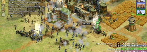
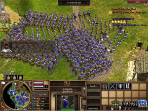
Trying to learn Planetary Annihilation has made me more appreciative for great UIs when it comes to strategy games as at this moment it doesn’t have it. Thinking more about it and what makes a good UI, I return back to Rise of Nations and how it really was and still is ahead of its time with one of the best UIs I’ve seen.
Emphasizing Management:
I’ve already written my love letter to Rise of Nations a few weeks ago and won’t be repeating too much about the gameplay itself and instead focus on the UI. When it comes to any strategy game regardless of it being real time or turned base, a good UI needs to be able to effectively show the player both the micro and macro layer of play.
What I mean is that the UI should be able to inform the player as to what’s going on with what they’re looking at and at the same time the greater big picture of the conflict. This means you should be able to effectively manage your troops during a fight, while still being able to tell what’s happening at your bases, produce units, check resources etc.
The less time you need to flip between bases and the battlefield is key for an effective UI. This is where having some kind of status bar/information pane is vital and why it became a standard for RTS design for the better part of the last decade.
The bottom portion of the screen was reserved for contextual information such as unit stats, building details and so on. This allowed you to quickly assess information or make commands in a centralized location. The best way to quickly perform actions would be the use of hotkeys which we’ll talk about next.
One of the problems with Planetary Annihilation’s UI is that instead of having a unified section for commands and information, you got three distinct areas of data: building commands on the bottom, resources at the top and unit orders on the right side.
Spreading out all your information and commands like this requires you to split your attention more than just having one or at most two areas of data.
Trying to manage an ever growing base has been one of the key challenges of RTS designers since its inception. We’ve seen everything from minimap usage, base commands built into the UI and even one time a game had picture in picture functionality that you could set up. Part of that management is having a UI that lets you make commands both through clicks and key presses.
Balancing Visual and Non Visual Commands:
Anyone who plays strategy games professionally or at the competitive level will tell you that learning hotkeys are vital for taking that step from novice to master. The ability to instantly give commands through key presses as opposed to mouse clicks cannot be understated for improving your play.
A good UI must have hotkeys for just about every command that the player would ever want to perform in your game. Going back to Rise of Nations, it featured one of the most extensive hotkey selections that I’ve ever seen in a RTS. The functionality goes beyond just giving commands but also offering additional utility such as being able to instantly select unit producing building, quickly start researches and more.
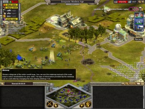
Being able to manage multiple areas at once requires both the use of hotkeys and visual indicators on the UI.
But no matter how important hotkeys are, you still need visual cues and commands that the player can see easily in order to learn your game.
A good UI must have clear visual icons and indicators to let them know what everything does. This means being able to perform almost any command that a hotkey would do via the visual UI.
Now that may seem counter intuitive — If player mastery requires hotkeys, why should you add more work on the visual side? The reason is twofold, first is that during the heat the moment, the player may forget your hotkeys (especially if you have tons like in Rise of Nations) and being able to perform the action or get the information visually is an important backup. Second has to do with education purposes which I’ll be coming back to in a minute.
Visual indicators are also important for cluing the player into any problems at their base or combat. Elements like idle workers, unit attacks, and building completion should have some visual mention on the UI so that the player has an idea of what’s happening. Important events should never just happen off screen without the player realizing it, there has to be some notification.
Setting up an effective hotkey guide is very difficult as the more commands you have, the more keys are needed and required knowledge of the player. Even if you go with using the first letter of the command as your hotkey, you’ll still run out of keys very fast.
One suggestion is to use a convention that is standardized among those set of commands: Such as all buildings are based on the second letter in their name, unit commands the first and etc. Having a secondary level of association like with gamepad controls makes it a lot easier to learn commands and placements.
Before we move on to the final part here is in no particular order a set of hotkey commands that anyone building a RTS must have:
- Attack-move
- Select specific building
- Select all copies of specific building
- Select all military units
- Select specific military or general units
- Set control groups
- Change AI state( IE: defense, hold position, aggressive)
There are a lot more hotkey options available but these are the basic set that should be required by any RTS. Moving on we come to the last part of a good UI and that is providing that bridge towards learning the game.
Educational UIs:
Finally a good UI must be able to improve the player’s understanding of the game mechanics and controls. First with hotkeys, you should be able to see the hotkey command for any action, unit, building etc through the UI. With Rise of Nations, I’m betting most people didn’t stare at the giant hotkey list to memorize it, but instead found the hotkeys through the UI instead. Being able to quickly associate the action to the command that way makes it easier to learn and something I did when playing Rise of Nations.
Next, there should be an option to display advanced information about the game mechanics: Unit statistics, what they counter, what researches do etc. In Rise of Nations this information was displayed with no further interaction by the player while Age of Empires 3 had different degrees of information reveal to prevent overloading the player. You could actually remove all transparency in AOE 3 and it would tell you down to the decimal point what everything did.
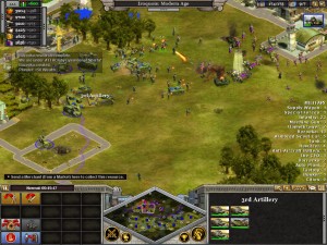
The more information you show the player on the UI, the more it will help their understanding, but good UI design is also about not overloading the player.
Being able to learn through the UI is important as most often the game itself moves too fast for you to really build on your understanding. If you’re already an expert player, you’ll be able to make changes such as optimization and build orders.
But new players won’t have the luxury of added knowledge and need the game to help explain what is happening.
Playing Planetary Annihilation, I had units completely get killed by a smaller enemy force and had no idea what happened. And in Starcraft, there are unit counters in the game but very little information on the UI as to what they are with exception to the major ones such as anti ground, anti air and anti stealth.
An Assistant and a Teacher:
While there aren’t as many strategy games today as they were in the last decade, understanding UI design is still an important tool for game designers. A great UI is a combination of form and function which are great lessons to understand.
Once again, the less flipping between screens or other pieces of information the player has to do, the better the UI is. And I really hope that Planetary Annihilation will have more work done as a RTS with a minimalist UI is not a good thing and that more designers will look at Rise of Nations as a high point in the RTS genre.

