We come to the final part for this series examining the worlds that modern AAA titles are built on. When we look at older series that tried to take place in the real world, there were a lot of unrealistic aspects of game design we had to ignore due to the fact that technology wasn’t at the point to show it all.
But with today’s graphics engines and millions spent on development, world design still feels trapped in the past.
All Roads Lead to Linearity:
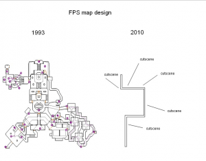
Let’s start at the macro level with level design. Ask a First Person Shooter fan the biggest change between level design back then and today and they’ll probably point to this picture:
While graphics have definitely gotten more advanced, the actual paths through these levels are majority one-way. This becomes all the more noticeable with games that take place in jungles or out in the country.
The Uncharted series for instance makes it very hard for the player to get lost as the jungles and ruins are unrealistically small. In games that take place in cities, you’ll find that almost every street is blocked in some way or the other, forcing the player down one or two specific roads.
These changes were done explicitly do guide the player from one set piece to another and keep the experience going at a steady pace. But this makes the levels lack depth and prevents the world from having any sense of geography.
Not to mention the fact that it made no sense that these characters can’t climb over rubble, jump small gaps and so on. One of the more annoying tropes was having a village or city to explore, but every door except for one was unlocked. If I’m carrying military grade weapons, then there should be no reason why I can’t shoot apart a wooden door.
One of the oldest barriers would be the dreaded “invisible walls” which for being included in so many games, is never explained why the character decides to just stop. Granted, as level design has become streamlined, the designers do a better job of corralling the player through the level which means less reason to use invisible walls.
Another gamey trope is collectibles which complaining about them is odd for me, considering that I’m one of those guys who will go after them. The problem with collectibles in most games is that they clash with the theme of the world and general geography.
You’re telling me that a long time ago that people decided to hide various knick knacks in areas that no one would realistically go? I will give credit to Rocksteady for the Batman Arkham series for figuring out a plausible way of doing collectibles with the use of the Riddler trophies.
Collectible hunting is one of those elements of gameplay that clash with the theme of the game. During our podcast with Chris Park from Arcen Games on Shattered Haven, I told him about how I broke the game by going the wrong way.
He laughed and said that he didn’t expect people who were following the story to go away from the goal. But then again, gamer logic dictates that the designers always hide the best stuff off the beaten track, training players to go the wrong way on purpose.
When designing a story that the player is supposed to be on a time-table, going down every corridor to find a mc-guffin tends to clash with that. However in the grand scheme of things, this issue is more or less considered a necessary evil to add more challenges and things for expert players to do.
Let’s move on from who the world is built and talk about how the world works.
Physics Frustration:
When we talk about game physics, this is where my thoughts land on the side of nit-picking. However when a designer is trying to create a realistic world, anything that seems out of place will stand out that much more compared to a cartoony or stylized setting.
There are three details that annoy me whenever I catch them in a “realistic” game. First is how boxes have the same density as cars that have the same as cement walls and so on, unless they were marked as destructible.

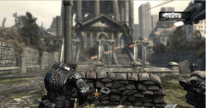
Indestructible chest high walls have become the norm for cover in shooter design, no matter how unrealistic.
The majority of objects placed in video games is considered static and are simply window dressing.
Such as when someone can hide behind a chest high wall for eternity which easily breaks immersion.
This detail is a big point about multiplayer balance, as if one player could just destroy all the cover; it would make it very easy for someone to dominate. But if you’re trying to create an engaging single player title, then you want to keep shaking up the experience.
The second detail is a combination of physics and level design. As we talked about in the first part, level design has become increasingly more linear and designers use a variety of obstacles to limit exploration.
What ends up happening is that we have a mobile character stuck in an immobile world. With many examples such as not being able to jump over chest high walls, the ability to only climb up select walls in the environment and so on.
These elements break the illusion that you are exploring a setting and instead show just how constrained the environment really is.
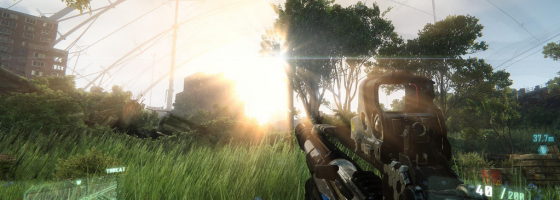
Finally the most “nit-picky” of the three for me: First Person Shooters where only the arms are being rendered on screen. I understand that most of the time, this is done for technical reasons as it is one less thing the programmer needs to worry about rendering and animating. But when you’re trying to tell a serious story having your character be just a floating pair of arms contradicts that.
Another issue is if your game has jumping segments, as it is harder to gauge your jumps when there are no legs to show your position on a ledge.
One other issue that doesn’t annoy me but has to be mention is crazy rag-doll effects. We see this in many First Person Shooters where the second an enemy dies their body spazs out as it falls to the ground, or when an explosive sends an enemy’s corpse cart-wheeling thirty feet in the air.
Now this could be debated as a good thing, as removing the reality from killing humans makes it seem less violent. One example of the opposite would be the Soldier of Fortune series which modeled realistic death and damage animations to human enemies such as being able to blow off limbs with a shotgun.
The next generation of consoles is coming soon and that means that the push for greater realism and graphical fidelity will also follow. As game makers strive to tell deeper stories and make use of all the technological advantages we have, it’s important to remember the gameplay.
The elements I’ve discussed over these five parts are all remnants of game design that we still cling to. For the next generation to truly revolutionize the industry, specifically AAA development, hopefully we’ll start seeing games that break away from these norms.


Pingback: 5 Realistic Fallacies in Game Design: Weapons | Game Wisdom()
Pingback: 解析游戏设计5大现实谬论之世界设计 | GamerBoom.com 游戏邦()